The old Silvi website desktop view looks outdated and cluttered, with a heavy gray-and-yellow design, a crowded vertical navigation menu, and poor visual hierarchy that makes key information hard to find; the large quarry image feels unengaging, the branding is inconsistent with multiple logos and shapes, and the press room section is plain and unattractive, while the overall fixed-width layout lacks mobile responsiveness, making it difficult to use on modern devices.
The new Silvi website desktop view is modern, bold, and visually engaging, using strong colors like yellow and dark blue to reinforce branding while highlighting key sections with clear typography and imagery; it organizes content into distinct blocks such as “Our Story,” “Our Commitment,” and “Our Foundation,” making navigation intuitive and storytelling compelling, while the large visuals, concise text, and responsive layout create a professional, user-friendly experience that effectively communicates Silvi’s identity and services.
The old Silvi website tablet view feels outdated and cluttered, with a heavy layout dominated by a large quarry image that overshadows key information, while the sidebar navigation looks cramped and text-heavy, making it harder for users to quickly find what they need; the overall design lacks visual hierarchy, relies too much on small text blocks with little breathing space, and doesn’t adapt well to modern tablet browsing expectations, which results in a clunky and less user-friendly experience.
The new Silvi website tablet view looks modern, bold, and visually appealing, with a strong hero image and clear tagline that immediately communicates quality and professionalism; the simplified navigation and use of large, engaging visuals for key sections like Locations, Services, and Ordering make it intuitive and easy to browse on a tablet, while the overall layout feels clean, responsive, and well-suited for touch interaction, giving users a seamless and engaging experience.
The old Silvi website mobile view looks outdated and cluttered, with too many buttons stacked vertically that make it feel overwhelming and hard to navigate; the text-heavy sections and inconsistent spacing reduce readability, while the overall design lacks modern responsiveness, visual hierarchy, and engaging imagery, giving it a clunky and less user-friendly experience compared to today’s mobile standards.
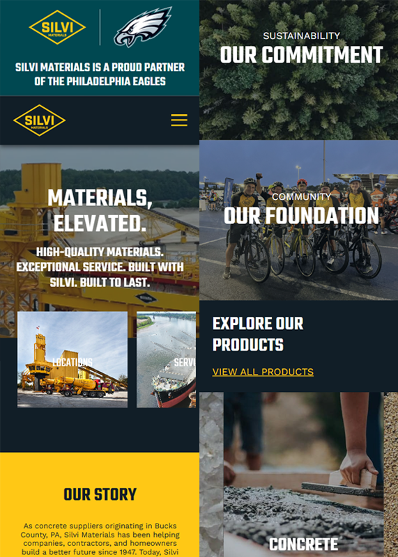
The new Silvi website mobile view is visually striking and modern, with bold typography, high-quality images, and a strong color contrast that enhances readability and engagement; its organized sections like “Our Story,” “Our Commitment,” and “Explore Our Products” are presented with clear hierarchy, while the responsive layout and interactive visuals make navigation smoother and the overall user experience far more dynamic and professional.