Redemption
Recovery
Redemption Recovery Group is a compassionate addiction treatment provider in Richland County, Ohio, dedicated to helping people reclaim their lives from substance abuse and co-occurring mental health challenges. Their personalized care blends evidence-based therapies with holistic support across partial hospitalization (PHP), intensive outpatient (IOP), and standard outpatient programs—all tailored to address each individual’s emotional, physical, relational, and spiritual needs. With a caring clinical team, supportive community, and a mission to “leave no stone unturned,” Redemption Recovery helps clients confront the storms of addiction courageously, build strength through connection, and discover a fulfilling, sober life worth living.
- Category
- Full-Service Branding, Development & SEO Growth Strategy
- Start Date
- 13 March 2023
- Client
- Redemption Recovery
- Handover
- 7 April 2023

Regular
Medium
SemiBold
Bold
This Is Text Message
Medium Typography
Just Amazing
Awesome
Branding: Logo Design


website design & development
Before:
Website Design & Performance Issues
The website appears to have a clean, professional design that aligns with the mission of the Redemption Recovery organization. However, the visual hierarchy could be improved, especially the contrast between text and background for readability. Also, the use of images and icons is effective but can be better optimized for faster load times and accessibility. Consider revising the mobile view to ensure responsiveness and smooth navigation across all device sizes.
After:
Strong Visual Design & User Trust Elements
The updated website design is visually appealing with a strong, cohesive theme that communicates the organization’s mission effectively. The use of imagery, especially the buffalo metaphor, is impactful, though some sections could benefit from a clearer visual hierarchy to improve readability. Additionally, the call-to-action buttons and forms are well-placed but may require further optimization for accessibility and smoother user interaction.
Before:
Tablet View Weaknesses
The tablet view of the website looks clean but could benefit from adjustments to improve mobile-friendliness and user experience. The text blocks are large and might cause scrolling issues, so optimizing for space and readability is crucial. Additionally, ensuring that buttons and forms are easy to interact with on smaller devices would enhance usability across different screen sizes.
After:
Tablet View Transformation
This website’s tablet view looks clean and well-structured, with a professional layout that maintains clarity. The call-to-action buttons like “Get Treatment” and “Our Services” are highlighted in blue, making them easily noticeable and user-friendly. The design balances imagery with text effectively, giving a supportive and approachable feel for visitors seeking addiction treatment.
Before:
Mobile View Weaknesses
In the mobile view, the form section looks a bit cramped, making it harder for users to fill in details comfortably. The text density is slightly overwhelming, and the balance between content and white space could be improved. Also, the call-to-action button blends in too much, reducing its visual impact compared to other highlighted areas.
After:
Mobile View Transformation
The mobile view presents the mission with clarity, with the buffalo symbolism resonating strongly with the message of resilience and recovery. The CTAs are well-highlighted, guiding users directly toward treatment and insurance verification without confusion. The overall design structure in mobile view maintains consistency, balancing supportive text with actionable steps, creating an encouraging and trustworthy experience for users.
Before: Outdated Hero Section – Issues
Before:
Website Design & Performance Issues
The website appears to have a clean, professional design that aligns with the mission of the Redemption Recovery organization. However, the visual hierarchy could be improved, especially the contrast between text and background for readability. Also, the use of images and icons is effective but can be better optimized for faster load times and accessibility. Consider revising the mobile view to ensure responsiveness and smooth navigation across all device sizes.

After:
Strong Visual Design & User Trust Elements
The updated website design is visually appealing with a strong, cohesive theme that communicates the organization’s mission effectively. The use of imagery, especially the buffalo metaphor, is impactful, though some sections could benefit from a clearer visual hierarchy to improve readability. Additionally, the call-to-action buttons and forms are well-placed but may require further optimization for accessibility and smoother user interaction.

Before:
Tablet View Weaknesses
The tablet view of the website looks clean but could benefit from adjustments to improve mobile-friendliness and user experience. The text blocks are large and might cause scrolling issues, so optimizing for space and readability is crucial. Additionally, ensuring that buttons and forms are easy to interact with on smaller devices would enhance usability across different screen sizes.

After:
Tablet View Transformation
This website’s tablet view looks clean and well-structured, with a professional layout that maintains clarity. The call-to-action buttons like “Get Treatment” and “Our Services” are highlighted in blue, making them easily noticeable and user-friendly. The design balances imagery with text effectively, giving a supportive and approachable feel for visitors seeking addiction treatment.

Before:
Mobile Website Weaknesses
In the mobile view, the form section looks a bit cramped, making it harder for users to fill in details comfortably. The text density is slightly overwhelming, and the balance between content and white space could be improved. Also, the call-to-action button blends in too much, reducing its visual impact compared to other highlighted areas.

After:
Mobile Website Highlights
The mobile view presents the mission with clarity, with the buffalo symbolism resonating strongly with the message of resilience and recovery. The CTAs are well-highlighted, guiding users directly toward treatment and insurance verification without confusion. The overall design structure in mobile view maintains consistency, balancing supportive text with actionable steps, creating an encouraging and trustworthy experience for users.

Core Web Vitals Before/After
Desktop


Mobile


SEO Growth Strategy
Search Performance Report (One Month After Optimization)
A month ago, the website recorded 5.94 million impressions and 59K clicks, achieving a 1% CTR and an average position of 14.1. Traffic remained steady with noticeable peaks, reflecting strong visibility and opportunities for further CTR optimization.


Three-Month Search Performance After Optimization
The website generated 5.94 million impressions and 59,000 clicks last three months, resulting in a 1% CTR and an average ranking of 14.1. Traffic patterns were stable with occasional spikes, signaling solid visibility and potential to boost CTR through ongoing optimization.
Search Performance Report (Six Months After Optimization)
Six months ago, the website had 59 thousand clicks, 5.94 million impressions, a 1% CTR, and an average position of 14.1. The steady flow of traffic, which reached its highest point toward the end of July, reflected the strong visibility and opportunities to increase CTR through targeted content and SEO enhancements.


Website Achievement – Google Search Impact
The search performance of our website has reached an important juncture in its development. In just 28 days, we had 22,000 clicks from Google Search as of April 8, 2025. We are steadily moving toward the next objective, which is to complete 18.6 out of 25 thousand clicks simultaneously. Our growing online visibility and the efficacy of our SEO efforts are highlighted by these accomplishments.
Steady Growth in Google Search Impact
The search engine performance of our website has impressively and steadily improved over time.
- On Sep 29, 2024, we achieved 15K clicks from Google Search in 28 days.
- By Oct 4, 2024, we reached 17K clicks in the same period.
- On Dec 2, 2024, we hit 20K clicks, marking a significant jump in engagement and visibility.
These milestones demonstrate that our ongoing SEO strategies are delivering results and that our audience is placing an increasing amount of trust in us.


Website Performance Summary – Last 7 Days
User activity decreased by 3.3% to 4.7K, representing a significant daily decrease of 52.3%.
- Page Views: 6.5K (+1.1%)
- Session Starts: 5.3K (−2.2%)
- First Visits: 4.7K (−1.2%)
- User Engagement: 4.7K (+0.1%)
Top Channel: The most popular method is organic search, which has fewer than 4,000 users, followed by paid search and direct traffic. User retention could use some work, despite the strong organic performance.
Traffic Summary – Last 7 Days
Organic Search accounts for 4.4K sessions (−4.6%), keeping its lead, while Display (+2,250%) and Cross-network (+26.2%) outperform expectations.
Best-performing pages: The Effects of Taking… (+13.1%) and Best Over-The-Counter… (+21.9%).
Geographically, the US leads (3.3K users, −2.2%), and Ireland continues to rise (+5.1%).


Website Performance Summary – Last 12 Months
The website experienced significant growth over the previous year:
- Active Users: 233K (+27.8%)
- Sessions: 266K (+22.9%)
- Page Views: 318K (+16.8%)
- Events: 1M (+22.6%)
From October to April, traffic was at its highest. Five people from the United States, Denmark, Australia, and the United Kingdom were online in the last 30 minutes.
Website Performance Summary – Last 90 Days
The website’s key metrics have all decreased over the past three months:
- Active Users: 57K (−7.9%)
- Sessions: 64K (−4.0%)
- Page Views: 77K (−2.8%)
- Events: 257K (−5.2%)
The patterns of traffic remained largely unchanged, with a slight decline in comparison to the previous period. Five people from the United States, Denmark, Australia, and the United Kingdom were online in the last 30 minutes.


Website Performance Summary – Last 30 Days
In the past month, the website recorded:
- Active Users: 20K (+1.5%)
- Sessions: 21K (−2.7%)
- Page Views: 26K (+1.7%)
- Events: 87K (+1.3%)
Sessions went down a little, but traffic stayed the same, and users and views went up a little. Five people from the United States, Denmark, Australia, and the United Kingdom were online in the last 30 minutes.
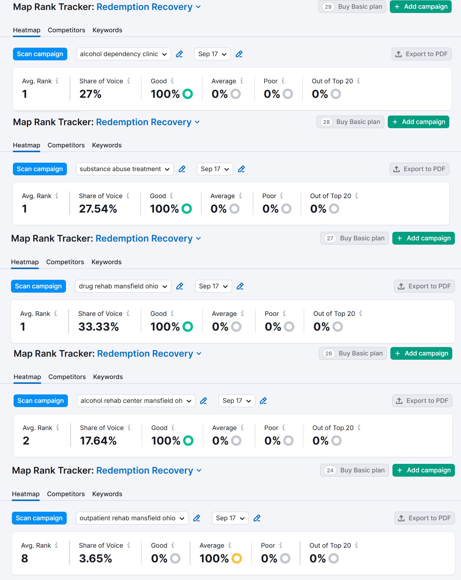
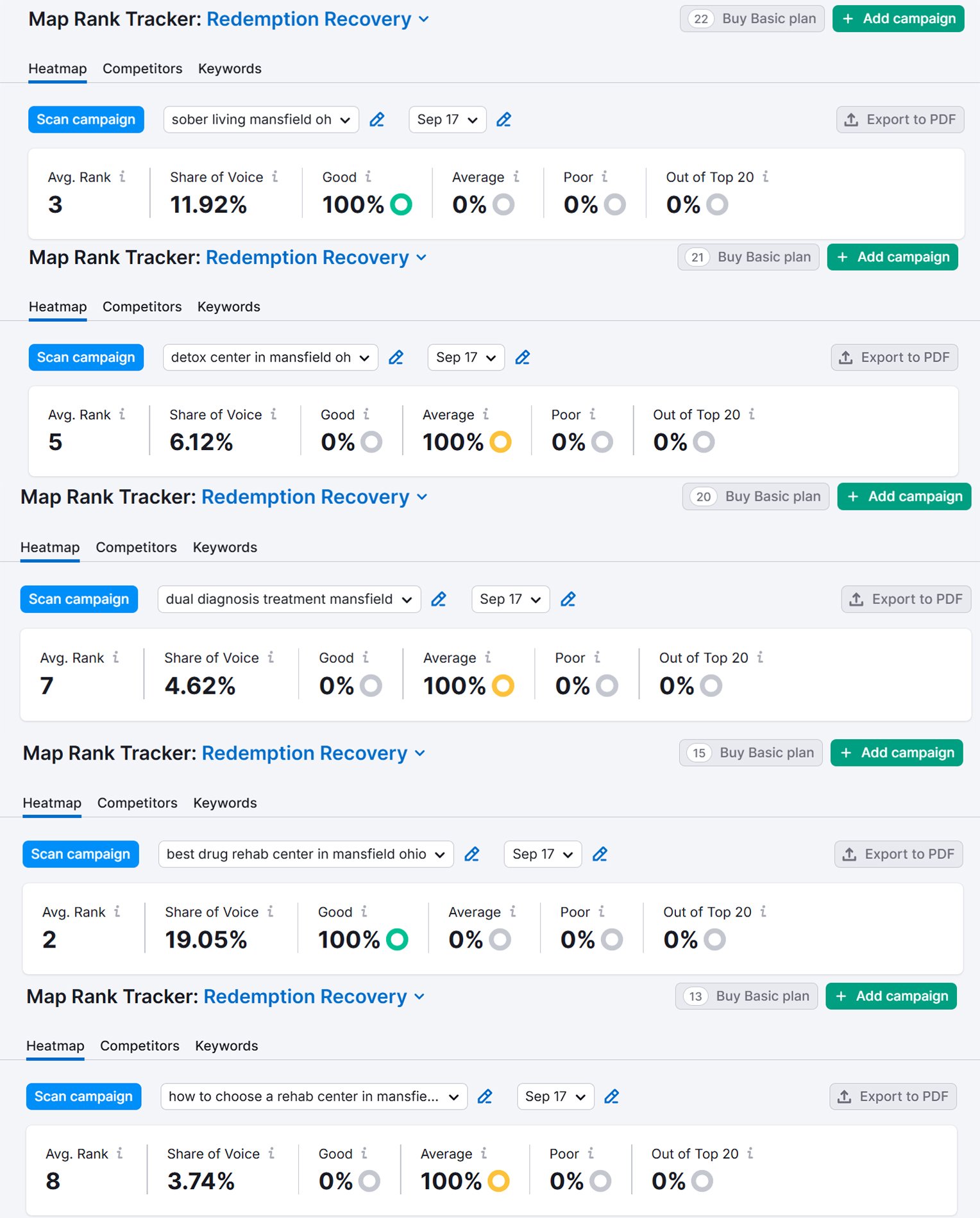
Google Map
Map 3 Pack
50 Miles Radius


