Old Home Stead
The Old Homestead Steakhouse, a New York City icon since 1868, is one of the oldest continuously operating steakhouses in the United States. Family-owned and steeped in tradition, it’s renowned for its generous cuts of prime, dry-aged beef and classic steakhouse charm. With its rich wood interiors and old-school ambiance, the restaurant offers a timeless dining experience rooted in quality, history, and hospitality. Whether you’re enjoying a signature porterhouse or indulging in premium Wagyu, The Old Homestead delivers an unforgettable taste of steakhouse excellence.
- Category
- Full-Service Branding, Development & SEO Growth Strategy
- Start Date
- 19 August 2024
- Client
- Old Home Stead
- Handover
- 28 September 2024

Regular
Medium
SemiBold
Bold
This Is Text Message
Medium Typography
Just Amazing
Awesome
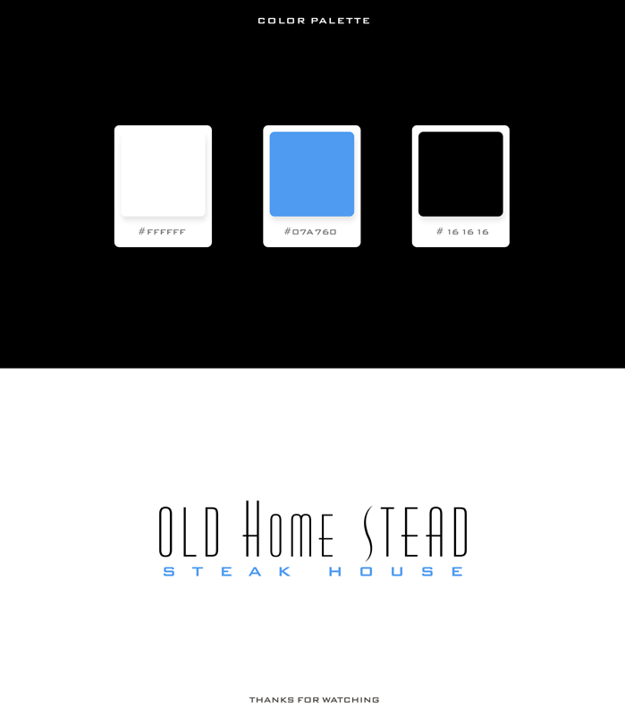
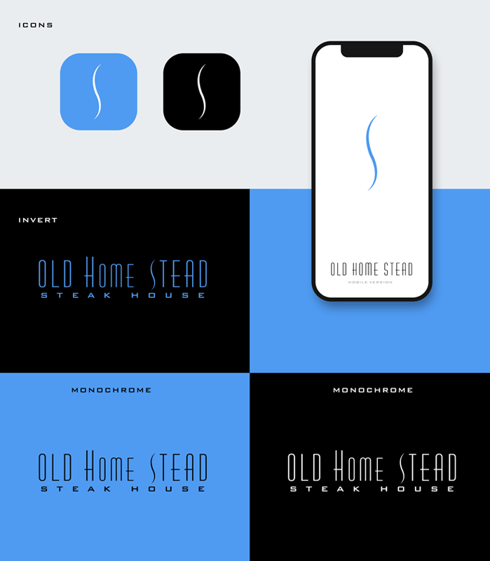
Branding: Logo Design


website design & development
Before:
Desktop Design Weaknesses
The layout feels outdated with a heavy dark theme that reduces readability and user engagement. Text is densely packed and lacks visual hierarchy, making it hard to scan quickly. Small, low-quality images and minimal interactive elements fail to showcase the venue’s appeal effectively.
After:
Website Strengths
The design feels modern and inviting with high-quality food photography that instantly captures attention. Strong visual hierarchy and clean typography make the content easy to read and engaging. Clear navigation and well-placed storytelling elements create a premium, user-friendly experience.
Before:
Tablet View Weaknesses
The dark background and dense text make readability difficult on tablet screens. Layout feels outdated with poor spacing and limited visual appeal, reducing engagement. Small images and lack of responsive design elements fail to highlight the venue effectively.
After:
Tablet View Transformation
The tablet view looks really elegant and classy. The high-quality food photography instantly grabs attention and perfectly highlights the premium feel of the brand. The overall navigation and layout feel polished, giving off a professional and timeless steakhouse vibe.
Before:
Mobile View Weaknesses
The mobile view feels outdated and not user-friendly. The text is too small and cramped, making it hard to read on smaller screens. There’s also a lot of wasted space with large empty black areas, and the overall design doesn’t feel optimized for a modern mobile experience.
After:
Mobile View Transformation
The mobile view looks clean and modern, with a strong focus on visuals that immediately capture attention. The text is well-structured and easy to read, making the content more engaging for users on small screens. The overall layout feels balanced and optimized, giving a premium and user-friendly experience.
Before: Outdated Hero Section – Issues
Before:
Desktop Design Weaknesses
The layout feels outdated with a heavy dark theme that reduces readability and user engagement. Text is densely packed and lacks visual hierarchy, making it hard to scan quickly. Small, low-quality images and minimal interactive elements fail to showcase the venue’s appeal effectively.

After:
Desktop Website Design Strengths
The design feels modern and inviting with high-quality food photography that instantly captures attention. Strong visual hierarchy and clean typography make the content easy to read and engaging. Clear navigation and well-placed storytelling elements create a premium, user-friendly experience.

Before:
Tablet View Weaknesses
The dark background and dense text make readability difficult on tablet screens. Layout feels outdated with poor spacing and limited visual appeal, reducing engagement. Small images and lack of responsive design elements fail to highlight the venue effectively.

After:
Tablet View Highlights
The tablet view looks really elegant and classy. The high-quality food photography instantly grabs attention and perfectly highlights the premium feel of the brand. The overall navigation and layout feel polished, giving off a professional and timeless steakhouse vibe.

Before:
Mobile Website Weaknesses
The mobile view feels outdated and not user-friendly. The text is too small and cramped, making it hard to read on smaller screens. There’s also a lot of wasted space with large empty black areas, and the overall design doesn’t feel optimized for a modern mobile experience.

After:
Mobile Website Highlights
The mobile view looks clean and modern, with a strong focus on visuals that immediately capture attention. The text is well-structured and easy to read, making the content more engaging for users on small screens. The overall layout feels balanced and optimized, giving a premium and user-friendly experience.

Core Web Vitals Before/After
Desktop


Mobile


SEO Growth Strategy
Monthly SEO Summary
the site gained 357 clicks from 73K impressions with a 0.5% CTR and an average position of 39.9. Steady visibility was maintained, with opportunities to improve CTR through better meta titles and descriptions.


3-Month SEO Performance Summary
Over the past three months, the site achieved 3.42K total clicks from 797K impressions, with an average CTR of 0.4% and an average position of 23.8. Search visibility remained strong, with steady growth in impressions and multiple traffic spikes, showing progress in keyword reach and ranking performance.
6-Month SEO Performance Summary
Over the last six months, the website achieved 5.72K total clicks from 1.17M impressions, with an average CTR of 0.5% and an average position of 27.5. The data shows consistent growth in impressions and clicks, along with noticeable traffic spikes, reflecting improved keyword rankings and increased search visibility.


Website Achievement — Google Search Impact
Our website has reached an exciting milestone in its SEO journey. As of August 2025, we achieved 1.2K clicks from Google Search within just 28 days. This reflects our growing online visibility and the success of our ongoing SEO efforts.
Website Achievement — Growing Google Search Impact
We’re proud to share steady growth in our website’s Google Search performance.
In just a few weeks, we’ve reached key milestones:
- 700 clicks on April 23, 2025
- 800 clicks on May 6, 2025
- 900 clicks on May 16, 2025
These achievements reflect our consistent SEO improvements and growing online presence. Thanks to everyone supporting this journey—onward to even greater impact!


Website Performance Summary — Last 7 Days
User activity reached 767, showing a steady trend, but slight decline signals a need for engagement improvements.
- Page Views: 6.5K
- Session Starts: 767
- First Visits: Approx. 720
- User Engagement: Holding steady, with 57 active users on the most recent day.
Top Channel: Organic Search (429 sessions), followed by Paid Search (181) and Cross-Network (148).
Organic continues to drive the majority of traffic, but Direct and Social traffic remain minimal.
Website Performance Summary — Last 30 Days
The website maintained steady performance with a slight decline toward the end of the period:
- Active Users: 3.2K (−2.3%)
- Sessions: 4K+ (Estimated from all sources)
- Page Views: ~8.5K (Estimated from session count)
- Top Day: Mid-July, before trending downward in early August
Traffic was primarily driven by Organic Search (2K sessions), with additional contributions from Direct (751), Paid Search (638), and Cross-network (511). Referral and Social channels remained low.
In the past 30 days, the majority of active users came from the United States (2.9K), followed by India, Canada, the UK, Pakistan, Germany, and Australia.
In the past 30 days, the majority of active users came from the United States (2.9K), followed by India, Canada, the UK, Pakistan, Germany, and Australia.


Website Performance Summary — Last 90 Days
The website maintained consistent growth over the last 90 days, with a few fluctuations in user activity:
- Active Users: 3.2K
- Sessions: ~11.5K
- Page Views: ~18K
- Daily Active Users: Averaged ~57
Website Performance Summary — Last 12 Months
The website experienced a major spike in traffic early in the year, followed by a steady baseline in user activity for the remaining months.
- Active Users: 3.2K monthly avg
- Sessions: ~11.5K
- Top Traffic Spike: Early in the year (as shown in the graph)
- Current Daily Active Users: 57

Google Map
Map 3 Pack
50 Miles Radius


social network states
Before:

After:

Before:
Starting Point Stats
Before starting our work, the account has 167 posts, 897 followers, and 1,178 following. This will be our baseline for tracking growth.
After:
Growth Achieved
After our efforts, the account grew to 954 posts, 36.9K followers, and 4,923 following. A clear sign of strong engagement and consistent progress.
Before:
Page Status Before Optimization
Old Homestead NYC’s Facebook page is starting with 144 followers, 88 likes and limited engagement. This snapshot shows the initial state before any improvements or growth efforts.
After:
Page Growth After Optimization
Old Homestead NYC’s Facebook page has grown impressively to 14K followers, 14K likes with stronger engagement. This reflects the positive impact of consistent strategy and content efforts.
Before:

After:

Before:

After:

Before:
Starting Point Stats
Old Homestead NYC’s Twitter presence before optimization – 804 followers and minimal engagement.
This snapshot reflects the account’s initial state, highlighting the opportunity for brand voice development, audience growth, and consistent social media activity.
After:
Growth Achieved
Old Homestead NYC’s Twitter presence saw strong growth, reaching 5,803 followers.
This snapshot highlights the results of targeted content strategy, consistent posting, and audience engagement — a clear uplift from the earlier stagnant profile.
Before:
Page Status Before Optimization
Old Homestead Steakhouse’s YouTube channel started with just 88 subscribers and 4 videos.
This snapshot captures the early stage of the brand’s video presence — minimal content, limited visibility, and an untapped opportunity for audience engagement through storytelling.
After:
Page Growth After Optimization
Old Homestead Steakhouse’s YouTube presence has grown significantly — now with 420 subscribers and 30 videos.
This improvement reflects a consistent content strategy, fresh branding, and deeper audience engagement that has brought the channel to life.
Before:

After:


