The design feels outdated with cluttered visuals and inconsistent typography, which reduces professionalism. Navigation is crowded and lacks modern responsiveness for seamless browsing. Heavy use of images and animations likely slows loading speed, negatively impacting user experience and SEO.
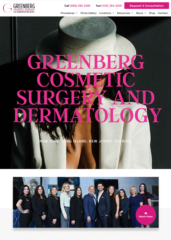
The modern design feels sleek and professional with bold typography that grabs attention instantly. High-quality imagery and clean layout create a premium look that reflects the brand’s credibility. Clear navigation and strong call-to-action buttons make it user-friendly and conversion-focused.
The design looks outdated with cluttered visuals and inconsistent alignment, making it less user-friendly on tablets. Text and navigation elements are small and cramped, reducing readability and touch accessibility. Overuse of heavy graphics slows performance and distracts from key calls-to-action.
The tablet view shows strong visual branding with clean layout and clear call options. Text contrast on the hero image needs improvement for better readability. Navigation elements appear small and may affect touch usability.
The mobile view feels cluttered and outdated, with inconsistent fonts and overlapping visual elements. Buttons like “CONTACT US TO LEARN MORE” are misaligned and may hinder user interaction. Overall design lacks modern responsiveness and clarity, making navigation less intuitive.
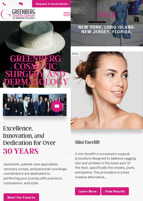
The mobile view is visually modern, clean, and user-friendly with consistent branding and vibrant CTA buttons. Content is well-organized, making navigation intuitive and engaging. Text hierarchy and image quality enhance readability and professionalism.