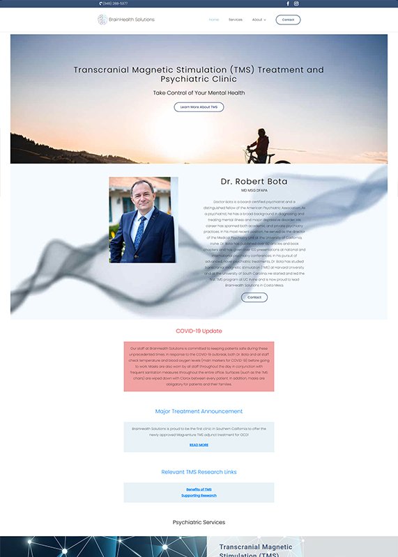
The layout feels slightly disjointed with the large empty space around the sections, making the page appear less cohesive. The use of multiple call-to-action buttons in close proximity can confuse visitors, making it harder for them to decide where to focus. Additionally, while the image of Dr. Robert Bota adds professionalism, the overall design could benefit from better image and text alignment to maintain visual flow.
The clean and modern design, with its calming color palette, creates a professional yet approachable feel. The large hero image gives an immediate sense of trust and expertise, while the well-organized sections make it easy to navigate. The clear call-to-action buttons, including scheduling consultations, enhance user engagement and ensure ease of access to services.
The text and image elements are not well-aligned, leading to an inconsistent flow and cluttered appearance. The large hero image takes up too much space, pushing critical content like Dr. Robert Bota’s profile too far down, which might make users miss it. Additionally, the limited use of color and lack of visual differentiation between sections may cause the page to appear monotonous.
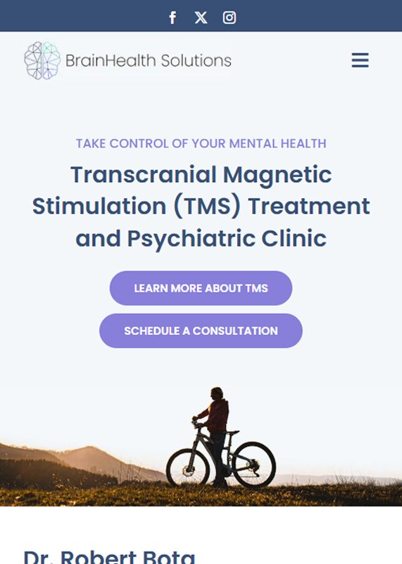
The tablet design is visually clean, with easy-to-read text and well-spaced elements, making it user-friendly. The large, clear call-to-action buttons stand out, driving users to schedule consultations or learn more. Additionally, the consistent use of calming colors and simple layout ensures a smooth, professional experience on smaller screens.
The text-heavy sections make it challenging to read on smaller screens, and there is little visual distinction between the sections, which could lead to confusion. The form on the right side seems cluttered, taking up too much space and reducing the focus on other key content. Additionally, the large hero image and content layout make the page feel unbalanced, potentially causing users to overlook important details.
The mobile layout is well-optimized with concise text and strategically placed images, ensuring easy navigation. The call-to-action buttons are large and accessible, enhancing the user experience. Additionally, the calming color scheme and clean typography create a professional and inviting atmosphere, making it easy for users to engage with the content.