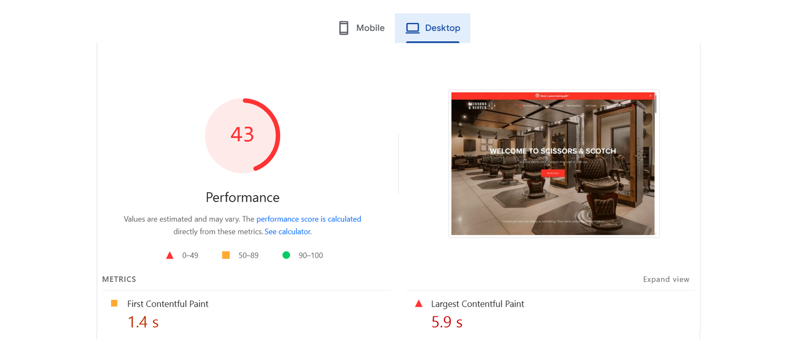
The desktop layout lacks visual hierarchy—large hero sections dominate without clear CTAs above the fold, making navigation feel secondary. Repetition of sections like “SEE WHAT YOU’VE BEEN MISSING” clutters the experience. Typography is bold but overused, reducing impact and making it harder to scan.
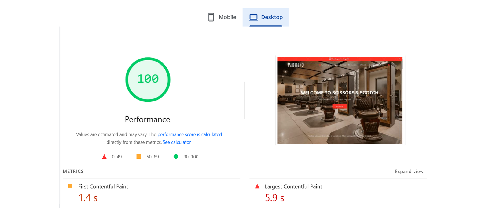
The desktop view of the Scissors & Scotch website is visually appealing, with high-quality images of the barbershop that instantly convey the vibe and brand identity. The navigation menu is clear and accessible, making it easy for users to find services, memberships, and booking options. The central CTA button (“Book Now”) is bold and well-placed, ensuring strong user engagement.
Tablet layout tries to mimic mobile but ends up too tight, especially with image-heavy blocks that don’t scale well, creating imbalance. Text overlays on images lack contrast, affecting readability. There’s also inconsistent padding, causing the layout to feel cramped and not touch-friendly enough.
The tablet view maintains consistency in branding and design while scaling elements proportionately. The use of icons and bold headings (like “FREE UPKEEPS” and “SPECIAL DISCOUNTS”) makes the content easily scannable, which is ideal for tablet browsing. It also balances visuals and text well, keeping the experience user-friendly without overcrowding the screen.
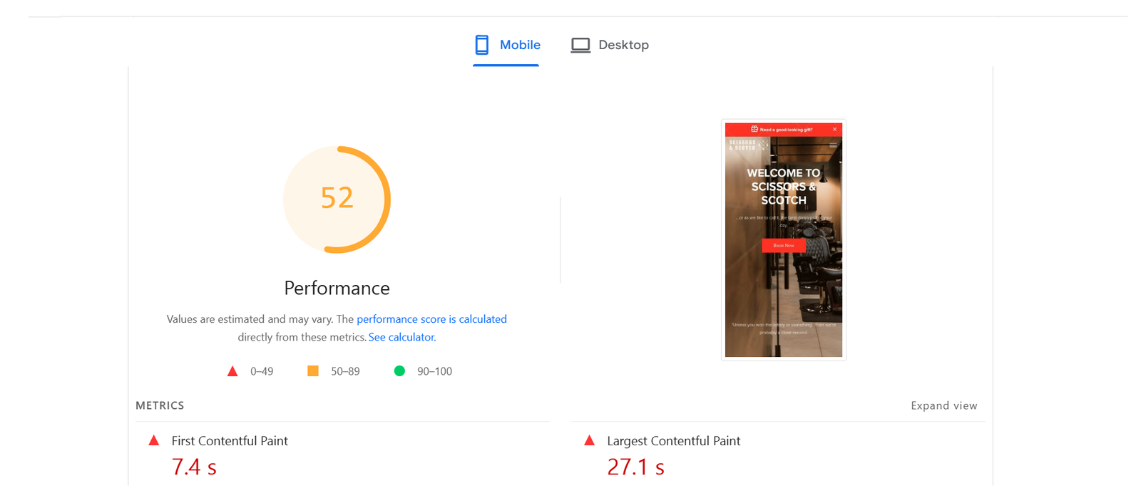
On mobile, the design becomes overly compressed—calls to action stack awkwardly, and image blocks crowd out essential content. Navigation is hidden in a hamburger menu with no preview or icons, reducing discoverability. Scroll fatigue sets in due to long, repetitive content without strong visual breaks.
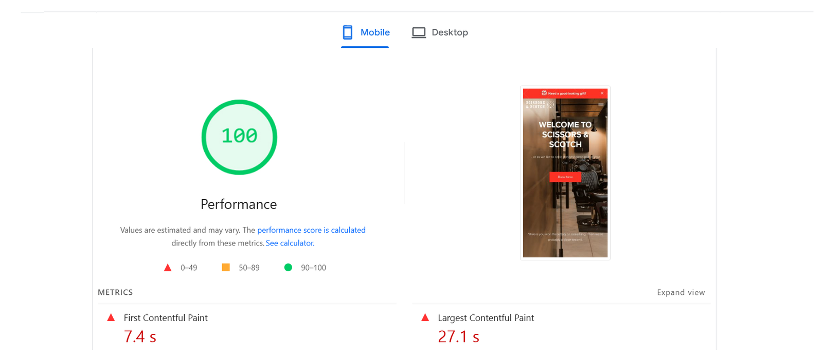
The mobile view is clean, optimized, and focused on delivering key information quickly with minimal scrolling. The call-to-action remains prominent, ensuring conversion opportunities are not lost. Typography and spacing are well-adjusted for smaller screens, maintaining readability and visual hierarchy.


