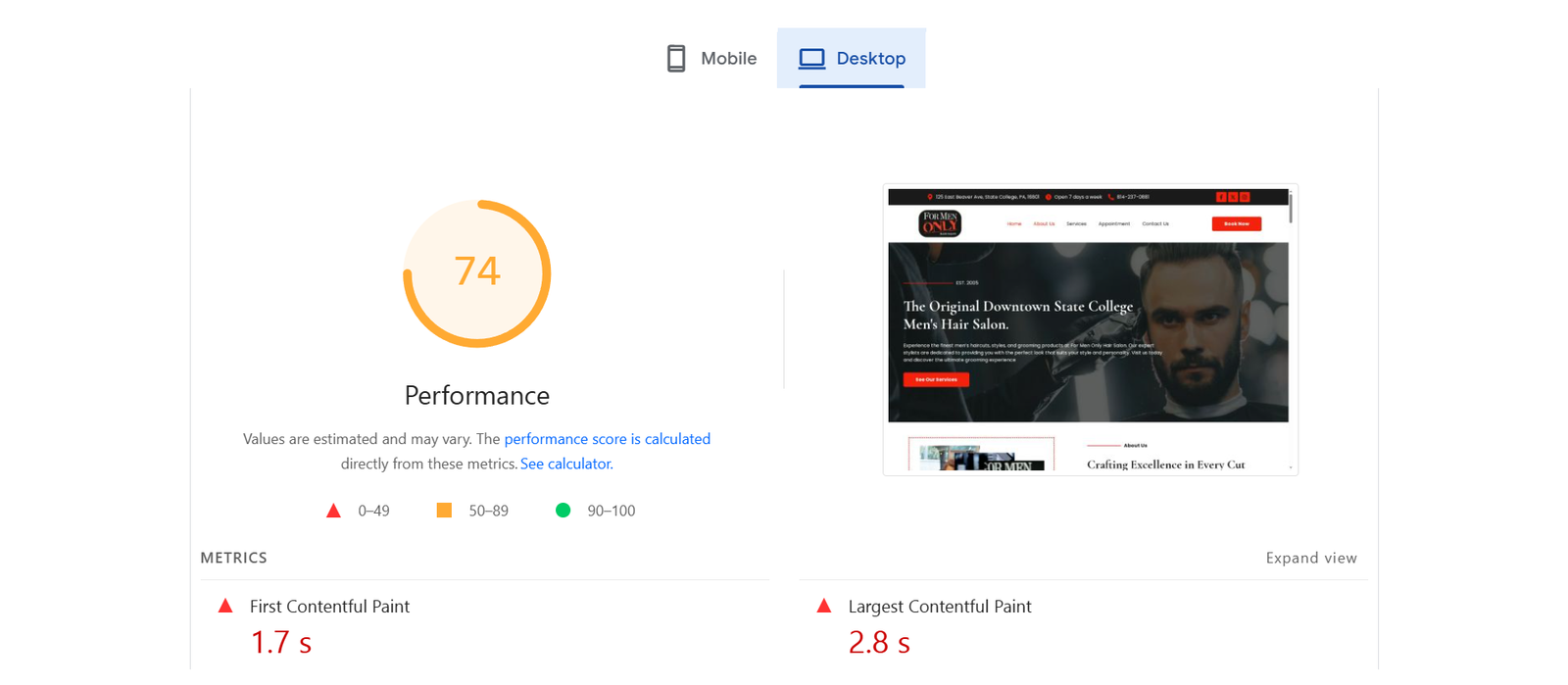
The desktop view of the For Men Only website feels outdated, with a heavy red background that overwhelms the design and poor image quality that reduces professionalism. The layout is cluttered, with small text and broken image icons at the bottom, which can harm user trust. Navigation is basic but lacks modern appeal and interactive engagement.
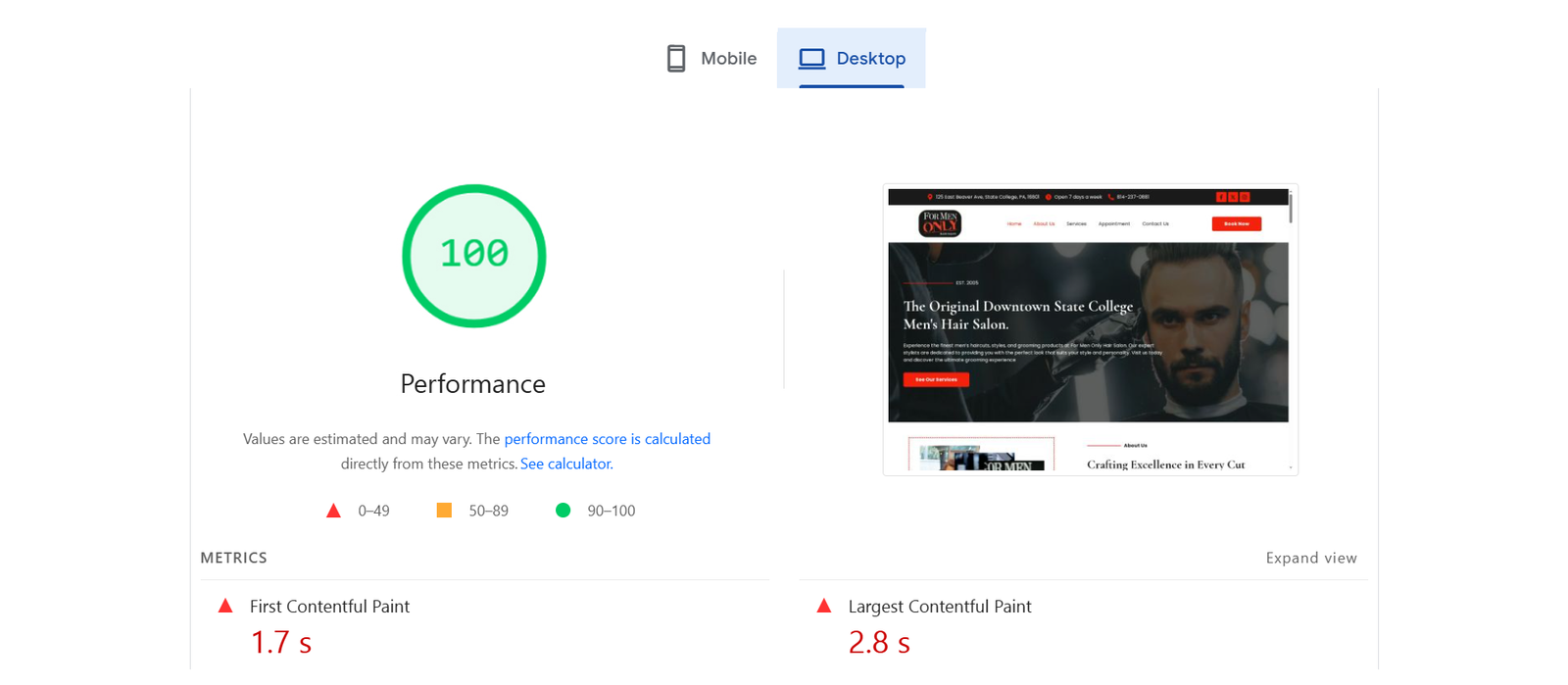
The desktop view of the For Men Only new website looks modern and professional, with clean typography, bold imagery, and strong CTAs that guide users effectively. The layout balances visuals and text, making it easy to scan while maintaining a premium feel. Navigation is intuitive, and important details like location and contact info are placed prominently.
The tablet view tries to present more content but struggles with alignment and readability. The use of long text blocks without proper spacing makes it visually tiring, and the lack of visual hierarchy means users may skip important information. The design does not scale gracefully, leaving an unpolished impression.
The tablet view adapts well with a responsive design, maintaining readability and user flow without overwhelming the screen. Service highlights with icons are visually appealing and neatly aligned, ensuring that users can quickly understand offerings. The mobile menu and booking button are easy to access, keeping conversion opportunities front and center.
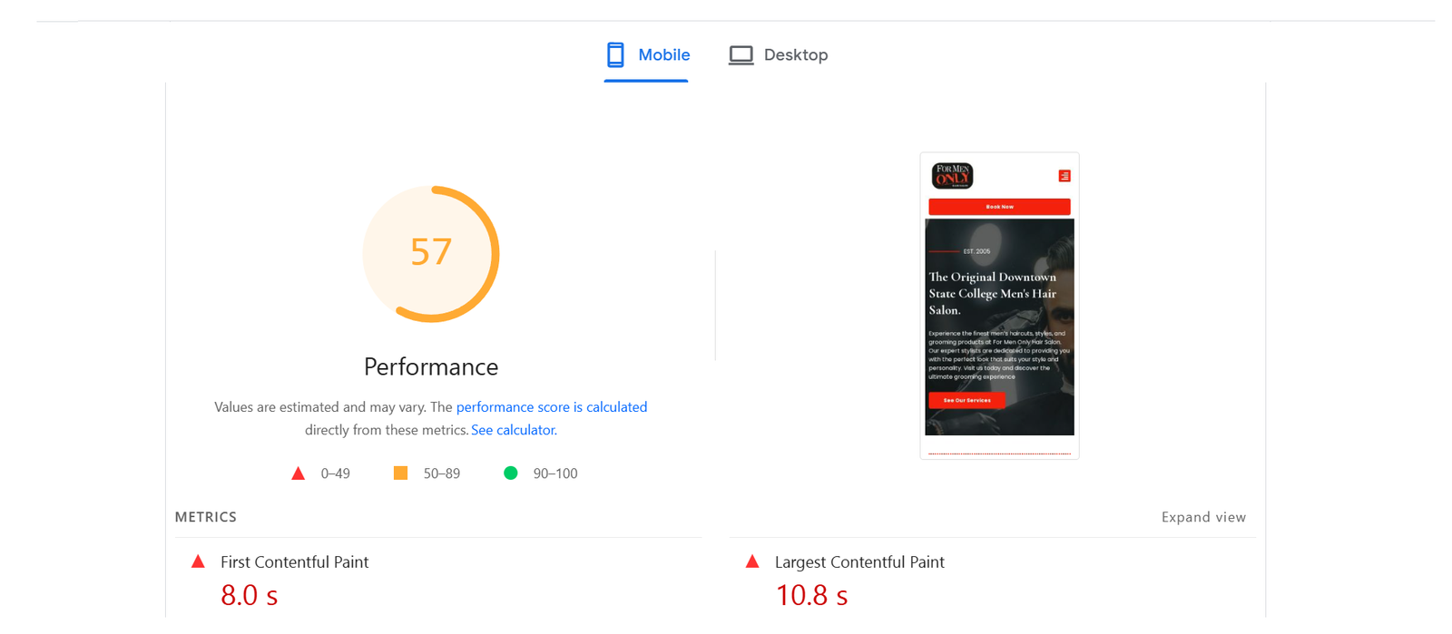
The mobile view is not well-optimized, as the layout looks compressed and still carries unnecessary heavy design elements. Broken images and inconsistent formatting disrupt the user experience, while the absence of a modern mobile-first approach makes it difficult for on-the-go users to engage smoothly.
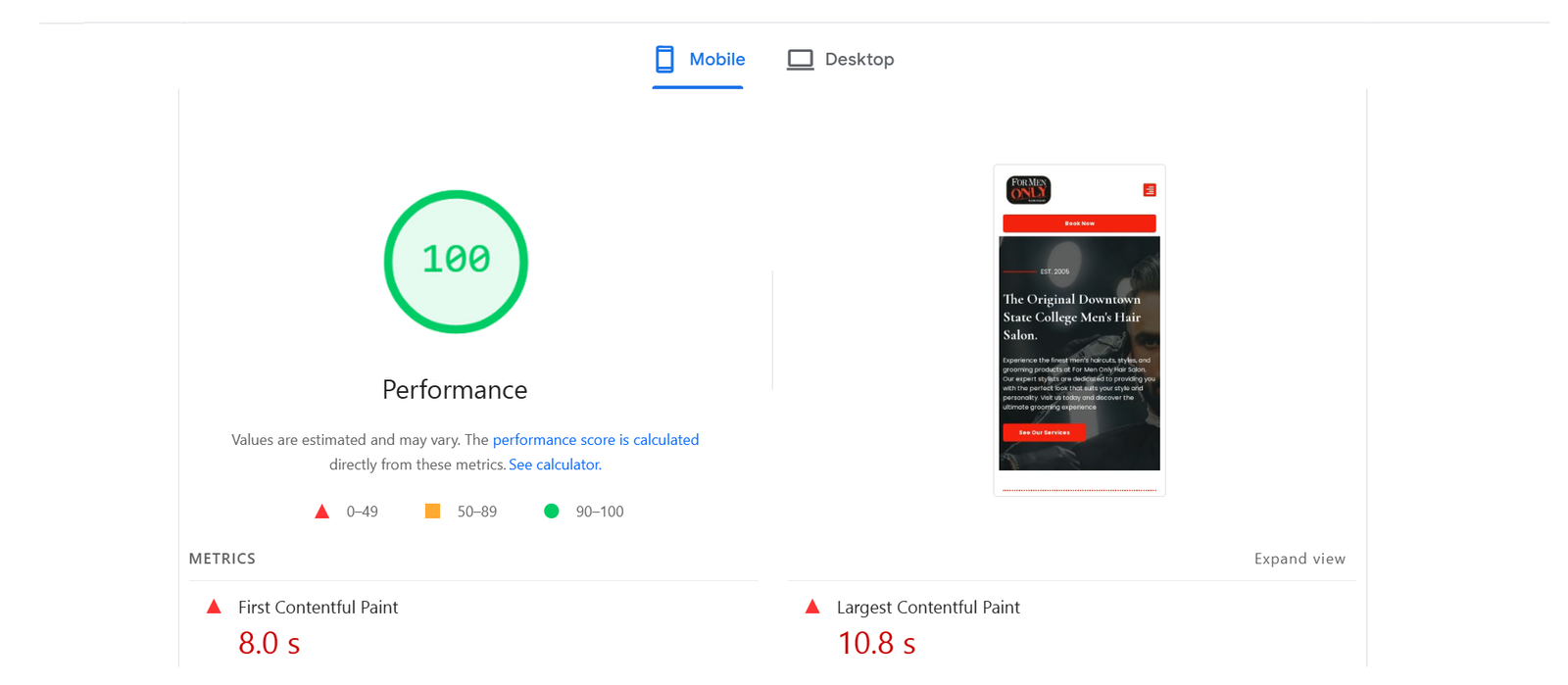
The mobile view is optimized for small screens with clear hierarchy and well-sized touch elements. The imagery remains strong, while text blocks are broken into digestible sections for quick browsing. The placement of service descriptions and CTAs ensures smooth navigation, giving users a seamless on-the-go experience.


