Liberty Hard Assets
Liberty Hard Assets LLC was a U.S. dealer based in Boca Raton, Florida, specializing in precious metals and rare collectible coins mainly gold and silver bullion, Peace Dollars, Morgan Dollars, and similar items. They advertised that all deliverable products were fully insured in transit and focused on sourcing difficult-to-find coins for collectors. According to Florida’s corporation records, however, the company status is now inactive, following a voluntary dissolution filed on July 10, 2023.
- Category
- Full-Service Branding, Development & SEO Growth Strategy
- Start Date
- 17 July 2023
- Client
- Liberty Hard Assets
- Handover
- 13 August 2023

Regular
Medium
SemiBold
Bold
This Is Text Message
Medium Typography
Just Amazing
Awesome
Branding: Logo Design


website design & development
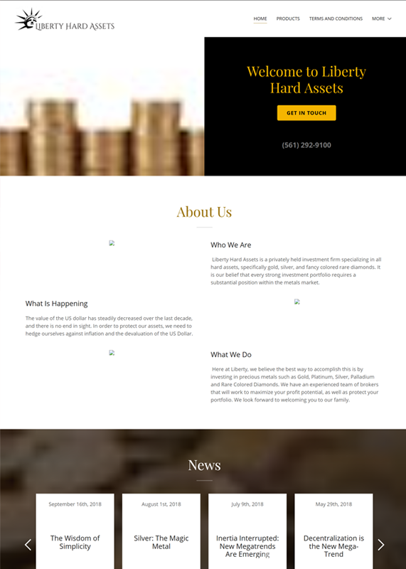
Before:
Desktop Design Weaknesses
The desktop view of this website has several issues that reduce its professionalism and usability. The images in the “About Us” section are broken, leaving empty icons that make the design look incomplete and unpolished. Additionally, the overall layout feels outdated with poor spacing, weak visual hierarchy, and a lack of modern design elements, which hurts credibility for an investment-focused brand.
After:
Website Strengths
This updated desktop layout looks much cleaner and more professional compared to the old version. The hero section is visually appealing with a clear call-to-action button and a well-placed callback form, which improves user engagement. The “Why Choose Us?” section uses icons, structured text, and imagery effectively, giving the site a modern, trustworthy, and user-friendly feel.
Before:
Tablet View Weaknesses
The tablet layout looks broken and unoptimized, with missing images in the “About Us” section leaving awkward gaps. The text alignment and spacing feel inconsistent, making it hard to read and reducing the professional impression. Overall, it lacks responsive design polish, which hurts user experience on mid-sized screens.
After:
Tablet View Transformation
The tablet layout is well-structured, with a responsive design that keeps the hero section balanced and the callback form easily accessible. The “Why Choose Us?” section adapts neatly, using icons, text, and imagery in a way that remains clear and visually appealing. Overall, it delivers a smooth user experience, maintaining readability and professionalism across medium-sized screens.
Before:
Mobile View Weaknesses
The mobile view looks cluttered, with overlapping sections and poor alignment that make the content hard to follow. Broken images in the “About Us” area further reduce credibility and create an unprofessional impression. The layout lacks proper responsiveness, leading to inconsistent spacing and a frustrating user experience on small screens.
After:
Mobile View Transformation
The mobile view is clean and well-optimized, with content stacking neatly for easy scrolling and readability. The inventory section is visually engaging, using product cards with clear images and labels that make browsing simple. Overall, the design feels modern, user-friendly, and maintains a professional look even on small screens.
Before: Outdated Hero Section – Issues
Before:
Desktop Design Weaknesses
The desktop view of this website has several issues that reduce its professionalism and usability. The images in the “About Us” section are broken, leaving empty icons that make the design look incomplete and unpolished. Additionally, the overall layout feels outdated with poor spacing, weak visual hierarchy, and a lack of modern design elements, which hurts credibility for an investment-focused brand.

After:
Website Strengths
This updated desktop layout looks much cleaner and more professional compared to the old version. The hero section is visually appealing with a clear call-to-action button and a well-placed callback form, which improves user engagement. The “Why Choose Us?” section uses icons, structured text, and imagery effectively, giving the site a modern, trustworthy, and user-friendly feel.

Before:
Tablet View Weaknesses
The tablet layout looks broken and unoptimized, with missing images in the “About Us” section leaving awkward gaps. The text alignment and spacing feel inconsistent, making it hard to read and reducing the professional impression. Overall, it lacks responsive design polish, which hurts user experience on mid-sized screens.

After:
Tablet View Highlights
The tablet layout is well-structured, with a responsive design that keeps the hero section balanced and the callback form easily accessible. The “Why Choose Us?” section adapts neatly, using icons, text, and imagery in a way that remains clear and visually appealing. Overall, it delivers a smooth user experience, maintaining readability and professionalism across medium-sized screens.

Before:
Mobile Website Weaknesses
The mobile view looks cluttered, with overlapping sections and poor alignment that make the content hard to follow. Broken images in the “About Us” area further reduce credibility and create an unprofessional impression. The layout lacks proper responsiveness, leading to inconsistent spacing and a frustrating user experience on small screens.

After:
Mobile Website Highlights
The mobile view is clean and well-optimized, with content stacking neatly for easy scrolling and readability. The inventory section is visually engaging, using product cards with clear images and labels that make browsing simple. Overall, the design feels modern, user-friendly, and maintains a professional look even on small screens.

Core Web Vitals Before/After
Desktop


Mobile


SEO Growth Strategy
Monthly SEO Summary
The website received 73 thousand impressions, 357 clicks, a 0.5% CTR, and an average position of 39.9. Improved meta titles and descriptions provided opportunities to increase CTR and maintain steady visibility.


3-Month SEO Performance Summary
From 797 thousand impressions, the website received 3.42 thousand clicks, with an average CTR of 0.4 percent and a position of 23.8. With a steady increase in impressions and multiple traffic spikes, search visibility remained robust, indicating progress in keyword reach and ranking performance.
6-Month SEO Performance Summary
The website received 1.17 million impressions, 5.72 thousand clicks, an average CTR of 0.5 percent, and an average position of 27.5 over the past six months. Improved keyword rankings and increased search visibility are reflected in the data’s consistent growth in impressions and clicks, as well as traffic spikes that are clearly visible.


Website Achievement — Google Search Impact
Our website has reached an exciting point in its SEO journey. As of August 2025, we had 1.2 thousand clicks from Google Search within just 28 days. This demonstrates our increased online visibility and how effectively our ongoing SEO efforts are working.
Website Achievement — Growing Google Search Impact
We are pleased to report that our website’s performance in Google Search has steadily improved. In just a few weeks, we have accomplished significant milestones:
- 700 clicks on April 23, 2025
- 800 clicks on May 6, 2025
- 900 clicks on May 16, 2025
Our consistent SEO enhancements and expanding online presence are reflected in these achievements. We are grateful to everyone who has supported this journey, and here’s to even greater impact!


Website Performance Summary — Last 7 Days
While there was a slight decline, user activity reached 767, indicating the need for engagement enhancements.
- Page Views: 6.5K
- Session Starts: 767
- First Visits: Approx. 720
- User Engagement: Holding steady, with 57 active users on the most recent day.
Organic Search is the most popular channel, with 429 sessions, followed by Paid Search (181) and Cross-Network (148). The majority of traffic still comes from organic sources, but there is still very little direct and social traffic.
Website Performance Summary — Last 30 Days
The website maintained steady performance with a slight decline toward the end of the period:
- Active Users: 3.2K (−2.3%)
- Sessions: 4K+ (Estimated from all sources)
- Page Views: ~8.5K (Estimated from session count)
- Top Day: Mid-July, before trending downward in early August
Organic Search is the most popular channel, with 429 sessions, followed by Paid Search (181) and Cross-Network (148).
The majority of traffic still comes from organic sources, but there is still very little direct and social traffic.


Website Performance Summary — Last 90 Days
Over the past ninety days, the website has grown consistently, with a few fluctuations in user activity:
- Active Users: 3.2K
- Sessions: ~11.5K
- Page Views: ~18K
- Daily Active Users: Averaged ~57
Website Performance Summary — Last 12 Months
At the beginning of the year, the website saw a significant increase in traffic, but user activity remained steady for the following months.
- Active Users: 3.2K monthly avg
- Sessions: ~11.5K
- Top Traffic Spike: Early in the year (as shown in the graph)
- Current Daily Active Users: 57

Google Map
Map 3 Pack
50 Miles Radius


