The old desktop view of this website looks outdated, cluttered, and unprofessional, with poor color choices like harsh green and blue backgrounds that make the text difficult to read, inconsistent font sizes and styles that hurt readability, and a layout overloaded with long paragraphs of text, leaving no breathing space for the user; navigation is confusing with too many scattered links, no clear hierarchy, and an overwhelming amount of medical claims that reduce trust, making the site feel more like a wall of text than a modern, credible health-focused platform.
The new desktop view of this website looks modern, professional, and user-friendly, with a clean design that uses high-quality images of pets to create an immediate emotional connection, clear typography that enhances readability, and a well-structured layout that guides users smoothly through categories; the navigation bar is simple and intuitive, promotional highlights like savings are presented with strong visuals and concise text, and the overall aesthetic feels trustworthy and welcoming, successfully balancing professionalism with warmth to improve both usability and brand credibility.
The old tablet view of this website looks outdated, cluttered, and visually unappealing, with harsh color choices like bright green and blue that clash and distract the reader, excessive text-heavy sections that overwhelm users instead of guiding them, and poor use of spacing that makes the layout feel cramped and difficult to navigate; the navigation links at the top are small and not optimized for touch interaction, while the overall design lacks any engaging visuals or modern UI elements, making it feel unprofessional and hard to trust for a health-focused brand.
The new tablet view of this website is modern, professional, and user-friendly, featuring a clean design with high-quality visuals that immediately create trust and appeal; the large hero image of pets alongside clear, bold text draws attention to promotions while maintaining a warm and approachable feel, and the navigation is simplified and well-organized at the top, making it easy to browse by product, condition, or ingredient; the use of white space, consistent fonts, and highlighted key points like “Made in the USA” ensures readability and brand credibility, while the call-to-action buttons are clearly visible, guiding users smoothly toward shopping and exploring products.
The old mobile view of this website is cluttered, text-heavy, and visually overwhelming, making it extremely difficult for users to navigate or focus on key information; the design is outdated with inconsistent fonts, poor alignment, and excessive use of bold and capitalized text, which strains readability; the color scheme of bright greens, blues, and reds lacks harmony and feels unprofessional, while the absence of proper spacing and clear calls-to-action makes the page confusing and frustrating to interact with on a small screen; overall, it fails to deliver a smooth, user-friendly mobile experience, leaving visitors likely to abandon the site quickly.
The new mobile view is clean, modern, and highly user-friendly, with a responsive design that adapts perfectly to smaller screens; the use of high-quality pet images immediately creates an emotional connection and makes the site visually appealing; the layout is simple and well-structured, with clear typography, balanced white space, and bold highlights (like Made in the USA) that emphasize trust and quality; the navigation is streamlined with a top search bar and menu, making it easy for users to find products quickly; strong calls-to-action like “Shop Now” are prominent and engaging, guiding users naturally toward purchases; overall, this design feels professional, trustworthy, and tailored for a smooth mobile shopping experience.
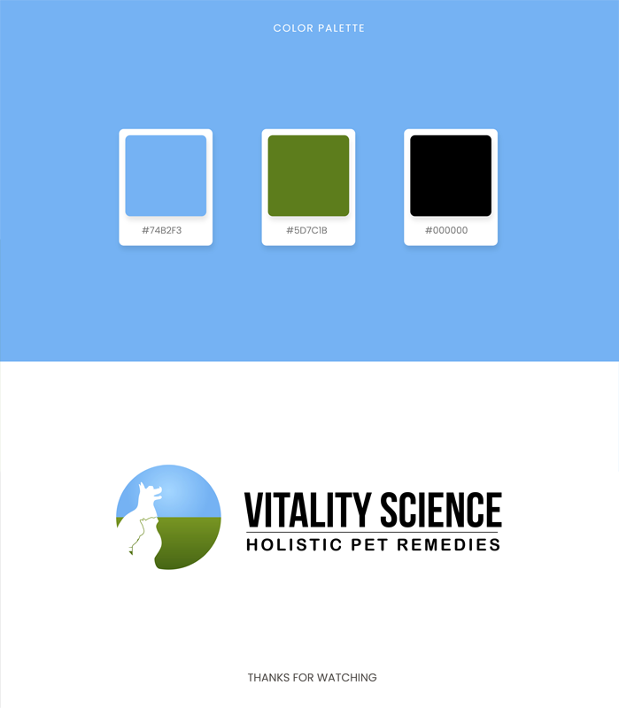

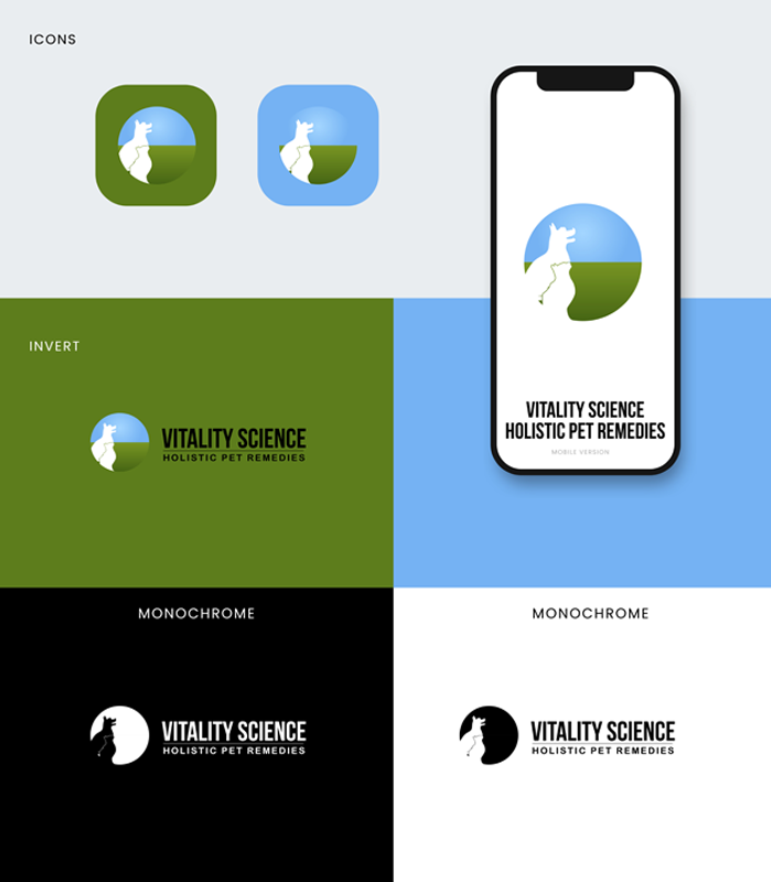
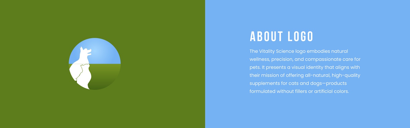


