The layout feels outdated, with excessive whitespace and a generic stock photo that lacks emotional impact. The call-to-action buttons are not prominent enough, blending into the design rather than standing out. Additionally, the font sizes and visual hierarchy are not optimized for quick scanning, making the content harder to digest at a glance.
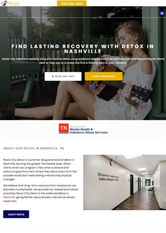
The website has a clean, modern design with a professional layout that builds trust. It uses clear headings, strong CTAs, and well-placed contact options for user convenience. Visuals and videos are integrated effectively to enhance engagement and credibility.
The design suffers from poor alignment and lack of adequate spacing between text and images, making it feel crowded. The call-to-action buttons are still not prominent enough, which could decrease user interaction. Furthermore, the image in the background, while attractive, distracts from the core message, making it hard for users to focus on the content.
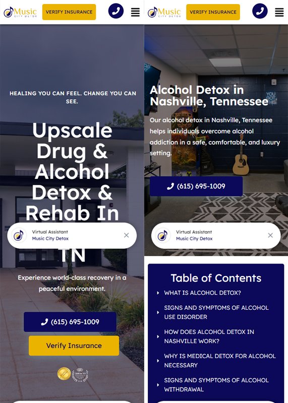
The tablet view maintains a clean and user-friendly interface, ensuring readability and accessibility. Key actions like calling and verifying insurance are prominently placed for quick access. The use of large visuals and embedded video creates an engaging and trustworthy first impression.
The text is too close to the edges, affecting readability and making the content feel cramped. The call-to-action buttons are too small, which could make it difficult for users to engage with the site on smaller screens. Additionally, the combination of large images and lengthy text impacts loading time and overall user experience on mobile devices.
The mobile view is well-optimized with large, tap-friendly buttons for quick actions. Content remains readable with a clean layout and effective spacing, ensuring a smooth user experience. The inclusion of a virtual assistant and table of contents improves navigation and accessibility.