The website design offers a clean and elegant layout, perfect for showcasing high-end jewelry, with a focus on clarity and ease of navigation. The images are sharp and vibrant, highlighting the intricate details of the jewelry pieces, which aligns with the brand’s luxurious and sophisticated aesthetic. However, the overall use of white space and font choices could be optimized to enhance readability and user engagement on desktop screens.
The new website design presents a more refined and elegant aesthetic, with a focus on beautiful imagery and a minimalist layout. The use of neutral backgrounds complements the jewelry, allowing the products to be the star of the page. The user experience is enhanced with easy-to-navigate categories, and the call-to-action buttons stand out for better engagement, while the soft color scheme adds to the luxurious, modern feel of the brand.
In the tablet view, the design feels quite sparse, with large empty spaces that may make the page appear unfinished or lacking in content. The text, though minimalistic, feels disconnected from the rest of the layout, and the large button at the bottom might seem out of place or overly emphasized. Additionally, the lack of detailed product images or engaging content above the fold could lead to a less engaging user experience.
This tablet view of the Everett jewelry website has a clean, elegant layout that aligns well with the luxury branding of the product. However, the top banner text (“Schedule a virtual consultation…”) could be more prominent or styled differently for better visibility, and the call-to-action buttons like “Shop Bands” and “View All” would benefit from stronger contrast for accessibility. Overall, the site achieves a premium aesthetic, but optimizing button hierarchy and ensuring responsive spacing adjustments would enhance both usability and engagement.
This mobile view feels a bit cluttered, with inconsistent spacing and visual hierarchy making it harder to scan quickly. The text on the banner and product names is small and could cause readability issues on smaller screens, while the “View Products” button lacks strong contrast, reducing its visibility as a call-to-action. Overall, the layout doesn’t feel as polished as the tablet version, and it would benefit from cleaner alignment, larger typography, and more breathing room between sections.
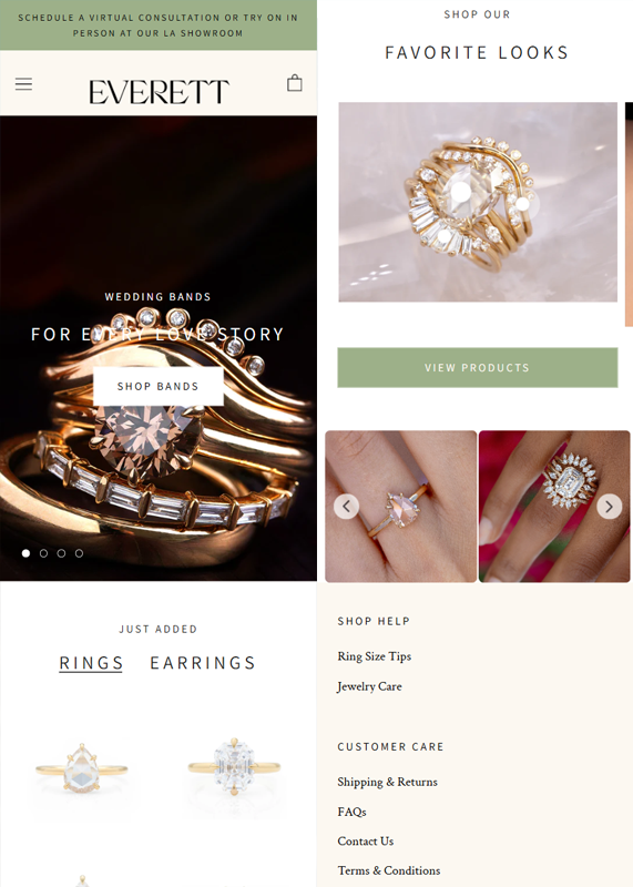
This updated mobile view is much stronger, with improved balance between visuals and text, making the jewelry pieces stand out beautifully. The call-to-action buttons like “Shop Bands” and “View Products” have better contrast and visibility, creating a clearer shopping flow. Additionally, the clean spacing, consistent typography, and inclusion of customer care links at the bottom enhance both usability and trustworthiness for mobile users.


