Red Mesa Cantina

Red Mesa Cantina is a vibrant downtown St. Petersburg hotspot that brings together the bold flavors of Latin and Caribbean cuisines in a festive, open-air setting. Located at 128 3rd Street South, the cantina is celebrated for its inventive small plates, ceviches, tacos, and house-made corn tortillas, all crafted with fresh, high-quality ingredients. The restaurant boasts one of the South’s most extensive selections of tequilas and mezcals, offering guests a diverse array of options to complement their meals. With its lively atmosphere, multiple bars, and a picturesque courtyard featuring an elaborate fountain, Red Mesa Cantina provides a memorable dining experience that has earned it a loyal following among locals and visitors alike.

Regular
Medium
SemiBold
Bold

This Is Text Message
Medium Typography
Just Amazing
Awesome

Branding: Logo Design

website design & development

Before: Outdated Hero Section – Issues

Before:

Desktop View Issues

The old Red Mesa Cantina desktop site looks outdated with a dull beige background and cramped layout. The navigation is small and hard to notice, while the text and images feel cluttered and disorganized. Important details like hours and contact info aren’t clear, and the design overall lacks modern appeal, making the site feel neglected rather than vibrant.

After:

Website Dev Audit - Desktop View

The new Red Mesa Cantina desktop site looks modern, vibrant, and full of energy. The bold colors, high-quality food photography, and playful typography instantly grab attention and reflect the lively Mexican dining experience. Navigation is clear and well-placed at the top, with standout buttons for reservations and online orders, making it easy for customers to take action. Sections like “Take Us To Go” and “Plan Your Big Day With Us” are visually engaging and well-structured, showcasing catering, events, and to-go options in a professional yet fun way. Overall, the design feels fresh, user-friendly, and very inviting.

Before:

Tablet View Issues

The old Red Mesa Cantina tablet site looks outdated and uninviting, with a dull beige wood-textured background that takes up most of the screen, making the content feel cramped and lost in the center. The text is small and difficult to read, while the navigation menu at the top lacks contrast and modern styling, giving it a flat, uninspired appearance. Images are low-quality and poorly arranged, failing to capture the energy of the restaurant. There’s no clear call-to-action, and the design feels static and lifeless, making it harder for users to stay engaged or find what they’re looking for.

After:

Tablet View Audit Transformation

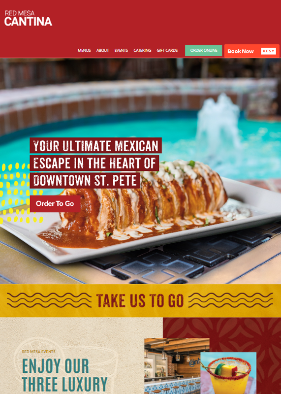
The new Red Mesa Cantina tablet site feels modern, colorful, and engaging, immediately drawing attention with bold food photography and vibrant design elements. The large, high-quality hero image paired with strong typography makes the message clear and inviting. Calls-to-action like “Order To Go” and “Book Now” are easy to find and stand out in bright buttons, making navigation effortless. The layout is clean yet dynamic, with fun textures and colors that reflect the restaurant’s lively atmosphere, while sections like event spaces and catering are showcased in a visually appealing way. Overall, it feels professional, user-friendly, and full of personality.

Before:

Mobile View Issues

The old Red Mesa Cantina mobile site feels outdated, cramped, and not optimized for small screens. The background takes up unnecessary space, while the actual content is squished into a small, hard-to-read section. Navigation is clunky and not touch-friendly, making it difficult for users to quickly find menus, hours, or contact details. The images look tiny and pixelated on mobile, which makes the food less appealing. Overall, the design lacks responsiveness, wastes valuable screen real estate, and doesn’t provide a smooth or enjoyable user experience.

After:

Mobile View Transformation

The new Red Mesa Cantina mobile site is bright, engaging, and perfectly tailored for smaller screens. It opens with bold visuals of delicious dishes and vibrant colors that instantly grab attention, while clear, modern typography makes the text easy to read. The layout is touch-friendly, with large buttons like “Order To Go” and “Red Mesa Events” that guide users effortlessly. Each section is visually distinct, using colorful backgrounds, textures, and photos to keep the experience dynamic and exciting. Overall, the design feels lively, professional, and user-friendly, making it easy for visitors to explore, order, or learn more on the go.

Core Web Vitals Before/After

Desktop

Mobile

SEO Growth Strategy

Monthly Performance Report — Google Search Results

In the past one month, our website generated 732 total clicks and received 209,000 impressions from Google Search. The average click-through rate during this period was 0.4%, with an average position of 41.4 in search results. These numbers reflect a steady presence in search visibility and provide a solid foundation for further optimization and growth in our SEO efforts.

Three-Month Website Performance Report — Google Search Impact

Over the past three months, our website has shown consistent growth in search visibility and engagement. We’ve achieved a total of 2,250 clicks and 604,000 impressions from Google Search. The average click-through rate remained steady at 0.4%, with an average search position of 39.5. These metrics highlight the effectiveness of our SEO strategy and continued efforts to improve content reach and discoverability.

Six-Month Website Performance Report — Google Search Insights

In the last six months, our website has reached a total of 5,220 clicks and 1.28 million impressions on Google Search. The average click-through rate stood at 0.4%, and the average position was 32.7. This performance highlights steady growth in search visibility and engagement, driven by ongoing SEO improvements and content optimization.

Google Search Impact Achievement

We’re on an exciting journey to reach 22,000 clicks from Google Search in just 28 days. So far, we’ve hit 732 clicks and continue to make progress toward this ambitious milestone.


Previously, we successfully achieved 20,000 clicks in 28 days on November 12, 2020 — a strong reminder of what’s possible through consistent effort and optimization.


We’re committed to pushing forward and surpassing our previous records!

Website Performance Summary — Last 7 Days

User activity remained modest over the past week, with steady traffic driven mostly by organic and direct channels.

Website Performance Summary — Last 30 Days

The website showed stable user activity over the past month, with a consistent performance across key channels.

Website Performance Summary — Last 90 Days

The website experienced a significant traffic spike in June, followed by a return to baseline activity levels. User engagement has remained steady in recent weeks.

Website Performance Summary — Last 12 Months

The website saw strong overall traffic with clear spikes and dips throughout the year. A noticeable surge occurred mid-year, while the most recent activity appears to be stabilizing.

Google Map

Map 3 Pack

50 Miles Radius

social network states

Before:

After:

Before:

Starting Point Stats

Before starting our work, the account has 359 posts, 1.23K followers, and 46 following. This will be our baseline for tracking growth.

After:

Growth Achieved

After our efforts, the account grew to 1,599 posts, 13.5K followers, and 126 following. A clear sign of strong engagement and consistent progress.

Before:

Page Status Before Optimization

Red Mesa Cantina’s page had a solid visual identity with 1.29K followers, but limited engagement and content depth. A strong foundation was in place — just waiting to be activated.

After:

Page Growth After Optimization

Red Mesa Cantina’s Facebook page has grown impressively to 24K followers with stronger engagement. This reflects the positive impact of consistent strategy and content efforts.

Before:

After: