Grand Hacienda
Grand Hacienda is a vibrant and welcoming Mexican restaurant offering an authentic taste of Mexico across several Florida locations. Known for its rich flavors and handcrafted dishes, the restaurant blends traditional family recipes with a modern dining experience. From fresh guacamole and sizzling fajitas to hearty breakfasts and house-made margaritas, every meal is a celebration of culture and cuisine. Whether you’re dining in, ordering online, or planning a catered event, Grand Hacienda brings warmth, flavor, and hospitality to every table.
- Category
- Full-Service Branding, Development & SEO Growth Strategy
- Start Date
- 24 Aug 2023
- Client
- Grand Hacienda
- Handover
- 16 Sept 2023

Regular
Medium
SemiBold
Bold
This Is Text Message
Medium Typography
Just Amazing
Awesome
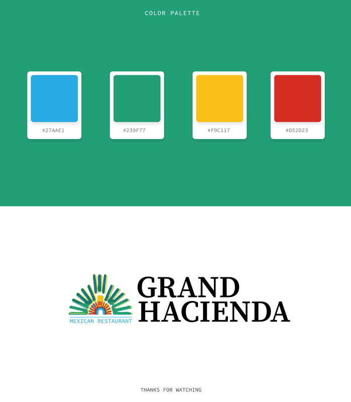
Branding: Logo Design


website design & development
Before:
Desktop Design Weaknesses
The desktop view looks outdated and lacks a professional layout. The form fields are poorly aligned over the food image, making it cluttered and hard to use. There’s also too much empty gray space, minimal styling, and weak typography, which makes the site feel unfinished and not visually engaging.
After:
Desktop Design Strengths
The desktop view looks vibrant, modern, and very engaging. Bright colors, bold typography, and high-quality food images create an inviting atmosphere that reflects the restaurant’s lively brand. The layout is well-structured with clear calls-to-action for reservations, menus, and specials, making it easy for users to navigate and connect with the restaurant.
Before:
Tablet Design Weaknesses
The tablet view feels outdated and unpolished. The reservation form dominates the screen, pushing important content too far down, which can overwhelm users instead of engaging them. The large background food image is visually heavy and makes the text difficult to read. Navigation links at the top are small and not very touch-friendly for tablet users. Overall, the design lacks balance, modern styling, and user-friendly flow.
After:
Tablet Design Strengths
The new tablet view feels modern, vibrant, and well-structured. The bold banner at the top instantly grabs attention with clear promotions like “Fajita Thursday”, making it engaging for visitors. Navigation is neatly placed at the top, easy to access, and touch-friendly for tablet users. The large, clearly defined buttons for Reservations, Menu, Specials, and Catering make the user journey straightforward and convenient. The “Welcome” section balances text with colorful food images, creating both warmth and appetite appeal. Overall, it feels polished, professional, and inviting—perfect for a restaurant website on tablet devices.
Before:
Mobile Design Weaknesses
The old mobile view feels outdated and poorly optimized, with a cluttered layout, small fonts, and white text placed over busy food images that hurt readability. Navigation is weak since the menu is just plain text links instead of a mobile-friendly bar or hamburger menu, making it confusing for users. The reservation form takes up too much space and overwhelms the screen, while call-to-action buttons like “Order Today” or “Make a Reservation” don’t stand out enough to grab attention. Uneven spacing and inconsistent visuals further add to the unpolished feel, making the overall experience frustrating rather than smooth for mobile users.
After:
Mobile Design Strengths
The new mobile view feels modern, clear, and easy to use, with a clean layout that highlights the most important actions like reservations, store pages, and directions through bold green buttons that stand out and guide the user. The hamburger menu keeps navigation simple and uncluttered, while the bright call-to-action text, “Call us for Reservations or Order to Take out!”, is prominent and inviting. Locations are neatly listed with addresses and phone numbers, making it quick to find essential details without extra scrolling. Overall, the design is more professional, visually appealing, and user-friendly, creating a smooth and accessible mobile experience.
Before: Outdated Hero Section – Issues
Before
Desktop Design Weaknesses
The desktop view looks outdated and lacks a professional layout. The form fields are poorly aligned over the food image, making it cluttered and hard to use. There’s also too much empty gray space, minimal styling, and weak typography, which makes the site feel unfinished and not visually engaging.

After
Desktop Design Strengths
The desktop view looks vibrant, modern, and very engaging. Bright colors, bold typography, and high-quality food images create an inviting atmosphere that reflects the restaurant’s lively brand. The layout is well-structured with clear calls-to-action for reservations, menus, and specials, making it easy for users to navigate and connect with the restaurant.

Before
Tablet Design Weaknesses
The tablet view feels outdated and unpolished. The reservation form dominates the screen, pushing important content too far down, which can overwhelm users instead of engaging them. The large background food image is visually heavy and makes the text difficult to read. Navigation links at the top are small and not very touch-friendly for tablet users. Overall, the design lacks balance, modern styling, and user-friendly flow.

After
Tablet Design Strengths
The new tablet view feels modern, vibrant, and well-structured. The bold banner at the top instantly grabs attention with clear promotions like “Fajita Thursday”, making it engaging for visitors. Navigation is neatly placed at the top, easy to access, and touch-friendly for tablet users. The large, clearly defined buttons for Reservations, Menu, Specials, and Catering make the user journey straightforward and convenient. The “Welcome” section balances text with colorful food images, creating both warmth and appetite appeal. Overall, it feels polished, professional, and inviting—perfect for a restaurant website on tablet devices.

Before
Mobile Design Weaknesses
The old mobile view feels outdated and poorly optimized, with a cluttered layout, small fonts, and white text placed over busy food images that hurt readability. Navigation is weak since the menu is just plain text links instead of a mobile-friendly bar or hamburger menu, making it confusing for users. The reservation form takes up too much space and overwhelms the screen, while call-to-action buttons like “Order Today” or “Make a Reservation” don’t stand out enough to grab attention. Uneven spacing and inconsistent visuals further add to the unpolished feel, making the overall experience frustrating rather than smooth for mobile users.

After
Mobile Design Strengths
The new mobile view feels modern, clear, and easy to use, with a clean layout that highlights the most important actions like reservations, store pages, and directions through bold green buttons that stand out and guide the user. The hamburger menu keeps navigation simple and uncluttered, while the bright call-to-action text, “Call us for Reservations or Order to Take out!”, is prominent and inviting. Locations are neatly listed with addresses and phone numbers, making it quick to find essential details without extra scrolling. Overall, the design is more professional, visually appealing, and user-friendly, creating a smooth and accessible mobile experience.

Core Web Vitals Before/After
Desktop


Mobile


SEO Growth Strategy
Search Performance Report (28 Days Overview)
The website received 73 thousand impressions, 357 clicks, a 0.5% CTR, and an average position of 39.9. Improved meta titles and descriptions provided opportunities to increase CTR and maintain steady visibility.


Search Performance Report (3-Month Overview)
Over the past three months, the website saw 18.3K clicks, 1.6M impressions, a 1.1% CTR, and an average position of 23.8. The data show a steady upward trend with several significant traffic peaks, which indicates increased engagement and visibility. As optimization efforts continue, it is anticipated that rankings will rise and click-through rates will become more consistent.
Search Performance Report (6-Month Overview)
Over the past six months, the website received 27.9K clicks, 2.85M impressions, a 1% CTR, and an average position of 29. The data indicate that visibility has increased, with a particular increase in the last few weeks. The ongoing emphasis placed on SEO is contributing to the rise in both traffic and search engine performance as a whole.


Google Search Achievement Update
With 7.02K or 15K clicks in the last 28 days, the website is moving toward its next milestone. A previous milestone of 14,000 clicks was reached on February 28, 2023. That is followed by this. The website is well on its way to the 15K mark thanks to ongoing SEO efforts and increased visibility.
Milestone Achievements: Google Search Impact
Over the course of 28 days, the site has consistently met important performance milestones in Google Search, indicating solid growth in organic visibility:
- 14K clicks – Achieved on Feb 28, 2023
- 13K clicks – Achieved on Feb 26, 2023
- 12K clicks – Achieved on Jan 16, 2023
- 11K clicks – Achieved on Jan 9, 2023
These accomplishments that have come in succession demonstrate a strong upward momentum. With continued optimization, the upcoming 15K click milestone, which is currently in progress, can be reached.


Website Performance Summary — Last 7 Days
With a slight decrease in daily engagement, user activity remained stable at 1.9K, maintaining the trend.
- Page Views: 2.6K
- Session Starts: 2.4K
- First Visits: 1.8K
- User Engagement: 1.9K
Top Channel: Organic Search topped the list with 1.8 thousand sessions, followed by Direct traffic (271) and Paid Search (153). Referral and social traffic, which are currently low, could be increased, despite the strong organic performance.
Website Performance Summary — Last 30 Days
The website showed steady user growth, with user activity reaching 8K in the last 30 days.
- Page Views: Estimated to exceed 10K+ based on active sessions
- Session Starts: ~9K, with a consistent upward trend
- First Visits: Approx. 7.9K via Organic Search
- User Engagement: Remains high, especially from key regions
Top Channel: 7.9 thousand sessions were generated by organic search, 1.2 thousand by direct search, and 560 by paid search. The small contributions from social, cross-network, and referral sources suggest that traffic sources could be more varied.


Website Performance Summary — Last 90 Days
Over the past 90 days, user activity steadily increased to 8K active users, demonstrating the website’s strong upward momentum.
- Page Views: Estimated well above 25K
- Session Starts: Continued strong momentum with ~30K+ sessions
- First Visits: Significant boost driven by search and direct sources
- User Engagement: Stable, with steady growth from global users
Website Performance Summary — Last 12 Months
Traffic to the website has significantly increased, largely as a result of paid search campaigns. After that, it has had a large number of users from all over the world and a significant organic presence.
- Page Views: Estimated 100K+
- Session Starts: Strong growth with >100K sessions
- First Visits: Increased significantly in sync with Paid and Organic campaigns
- User Engagement: Fluctuated but sustained ~8K in the most recent 30 days

Google Map
Map 3 Pack
50 Miles Radius


social network states
Before:

After:

Before:
Starting Point Stats
Before starting our work, the account has 319 posts, 436 followers, and 120 following. This will be our baseline for tracking growth.
After:
Growth Achieved
After our efforts, the account grew to 2,349 posts, 4,526K followers, and 2,150 following. A clear sign of strong engagement and consistent progress.
Before:
Page Status Before Optimization
Grand Hacienda’s Facebook page is starting with 517 followers and limited engagement. This snapshot shows the initial state before any improvements or growth efforts.
After:
Page Growth After Optimization
Grand Hacienda’s Facebook page has grown impressively to 8.7K followers with stronger engagement. This reflects the positive impact of consistent strategy and content efforts.
Before:

After:

Before:

After:

Before:
Starting Point Stats
Grand Hacienda’s Yelp page currently shows a low 2.0 rating with 32 reviews. This snapshot highlights the starting point before applying improvements and reputation-building efforts.
After:
Growth Achieved
Grand Hacienda’s Yelp page now reflects a 3.9 rating with 332 reviews.
This updated snapshot shows the impact of our optimization and review management efforts, helping build stronger credibility and customer engagement.

