Inspire Hospice
Inspire Hospice is a compassionate, Atlanta-area hospice provider dedicated to delivering exceptional end-of-life care that honors each individual’s quality of life, peace, and dignity. Founded in 2018 by experienced hospice professionals, their interdisciplinary team—including physicians, nurses, aides, social workers, chaplains, and volunteers—crafts personalized care plans that attend to physical comfort, emotional support, spiritual well-being, and family needs. With services such as pain and symptom management, bereavement support, music and pet therapy, caregiver respite, and innovative tools to keep loved ones connected, Inspire Hospice embraces a holistic, patient-centered approach that helps individuals and families navigate life’s final chapter with compassion and grace.
- Category
- Full-Service Branding, Development & SEO Growth Strategy
- Start Date
- 7 May 2024
- Client
- Inspire Hospince
- Handover
- 16 June 2024

Regular
Medium
SemiBold
Bold
This Is Text Message
Medium Typography
Just Amazing
Awesome
Branding: Logo Design


website design & development
Before:
Desktop View Issues
The desktop view feels outdated, with a cluttered layout and overly dense text, making it hard to navigate or engage with. The use of bright colors and heavy content sections lacks cohesion, which detracts from the overall user experience. There’s also a lack of modern design elements, which makes it feel unpolished and difficult to read.
After:
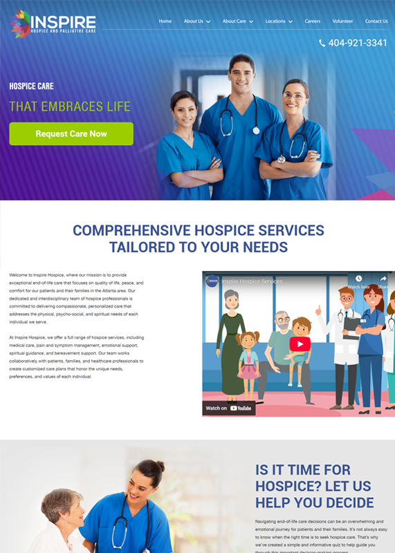
Website Dev Audit - Desktop View
The desktop view is vibrant and welcoming, with clear typography and a well-organized layout. The use of visuals, including videos and images of the team, adds a personal touch while the clean design enhances readability. The CTAs are prominent and user-friendly, offering a smooth and engaging browsing experience.
Before:
Tablet View Issues
The tablet view appears cluttered with too much text, making it difficult to quickly scan and find important information. The layout feels cramped, especially with the images and text overlapping or not adjusting properly. This results in a less-than-optimal user experience, with elements looking out of place on the smaller screen.
After:
Tablet View Audit Transformation
The tablet view is clean and well-organized, with a smooth layout that balances text and visuals effectively. The prominent CTA buttons and video content make the site engaging, while the typography and design ensure readability. Overall, it offers a polished, user-friendly experience that feels both professional and approachable.
Before:
Mobile View Issues
The mobile view is poorly optimized, with excessive text and tight spacing, making it difficult to read and navigate without zooming. The content is crammed together, and images don’t align well with the text, resulting in a cluttered, unappealing experience. The design lacks modern mobile responsiveness, negatively affecting usability.
After:
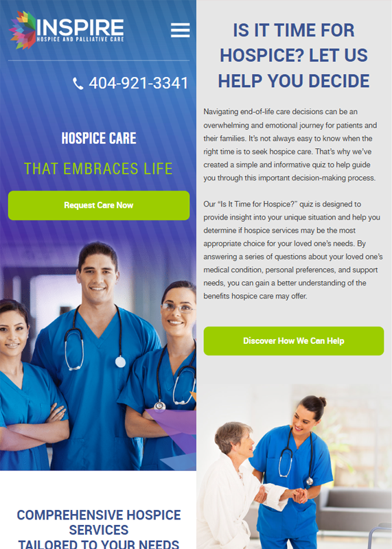
Mobile View Transformation
The mobile view is well-structured, with a clean layout and clear navigation. The use of prominent CTAs, like the “Request Care Now” and “Discover How We Can Help,” ensures easy access to key services. The design is modern, visually appealing, and provides a smooth user experience with readable text and engaging images.
Before: Outdated Hero Section – Issues
Before:
Desktop View Issues
The desktop view feels outdated, with a cluttered layout and overly dense text, making it hard to navigate or engage with. The use of bright colors and heavy content sections lacks cohesion, which detracts from the overall user experience. There’s also a lack of modern design elements, which makes it feel unpolished and difficult to read.

After:
Website Dev Audit - Desktop View
The desktop view is vibrant and welcoming, with clear typography and a well-organized layout. The use of visuals, including videos and images of the team, adds a personal touch while the clean design enhances readability. The CTAs are prominent and user-friendly, offering a smooth and engaging browsing experience.

Before:
Tablet View Issues
The tablet view appears cluttered with too much text, making it difficult to quickly scan and find important information. The layout feels cramped, especially with the images and text overlapping or not adjusting properly. This results in a less-than-optimal user experience, with elements looking out of place on the smaller screen.

After:
Tablet View Audit Transformation
The tablet view is clean and well-organized, with a smooth layout that balances text and visuals effectively. The prominent CTA buttons and video content make the site engaging, while the typography and design ensure readability. Overall, it offers a polished, user-friendly experience that feels both professional and approachable.

Before:
Mobile View Issues
The mobile view is poorly optimized, with excessive text and tight spacing, making it difficult to read and navigate without zooming. The content is crammed together, and images don’t align well with the text, resulting in a cluttered, unappealing experience. The design lacks modern mobile responsiveness, negatively affecting usability.

After:
Mobile View Transformation
The mobile view is well-structured, with a clean layout and clear navigation. The use of prominent CTAs, like the “Request Care Now” and “Discover How We Can Help,” ensures easy access to key services. The design is modern, visually appealing, and provides a smooth user experience with readable text and engaging images.

Core Web Vitals Before/After
Desktop


Mobile


SEO Growth Strategy

Monthly Performance Report — Google Search Results
Google Search has shown our website 732 total clicks and 209,000 impressions in the past month. During this time, the average position in search results was 41.4 and the average click-through rate was 0.4 percent. These numbers provide a solid foundation for further optimization and expansion of our SEO efforts and demonstrate a steady presence in search visibility.
Three-Month Website Performance Report — Google Search Impact
Over the past three months, our website has shown consistent growth in search visibility and engagement. From Google Search, we have received 604,000 impressions and 2,250 clicks. With an average search position of 39.5, the click-through rate remained constant at 0.4%. These metrics highlight the effectiveness of our SEO strategy and continued efforts to improve content reach and discoverability.


Six-Month Website Performance Report — Google Search Insights
Our website has received 5,220 clicks and 1.28 million impressions from Google Search in the past six months. The average position was 32.7 and the average click-through rate was 0.4 percent. This performance highlights steady growth in search visibility and engagement, driven by ongoing SEO improvements and content optimization.
Google Search Impact Achievement
In just 28 days, we will reach 22,000 clicks from Google Search, an exciting milestone. We’ve reached 732 clicks thus far and are making steady progress toward this significant milestone.
On November 12, 2020, we previously achieved 20,000 clicks in 28 days, serving as a powerful reminder of what is achievable with consistent effort and optimization.
We are determined to move forward and break previous records!


Website Performance Summary — Last 7 Days
Over the past week, user activity remained low, with steady traffic primarily coming from organic and direct channels.
- Active Users: 280
- Sessions: 410+
- Page Views: Estimated ~600–700
- User Engagement: 19 users active on the latest day
Website Performance Summary — Last 30 Days
Over the past month, the website’s user activity was consistent across all key channels and remained steady.
- Active Users: 1.4K
- Sessions: ~2K+
- Page Views: ~3K
- Daily Active Users: Averaged 19 on the most recent day


Website Performance Summary — Last 90 Days
In June, the website saw a significant increase in traffic before returning to its previous activity levels. In recent weeks, user engagement has remained constant.
- Active Users: 1.4K (30-day avg)
- Sessions: Estimated 7.8K+ total
- Peak Activity: Early June, with a sharp rise followed by a gradual decline
- Daily Active Users (Recent): 19
Website Performance Summary — Last 12 Months
Overall, the website saw a lot of traffic, though there were clear ups and downs throughout the year. Midway through the year, there was a noticeable uptick, and the most recent activity seems to be settling down.
- Active Users: 1.4K (30-day average)
- Sessions: ~31K+ total
- User Peaks: High activity between September–November and again in July
- Daily Active Users (recent): 19

Google Map
Map 3 Pack
50 Miles Radius


