The desktop view feels outdated, with a cramped layout, excessive text, and poor visual hierarchy that makes it hard to scan or navigate quickly. The design lacks responsiveness and modern UI elements, and the color palette feels dull and inconsistent. Overall, it doesn’t reflect the professionalism expected from a medical or cosmetic services website today.
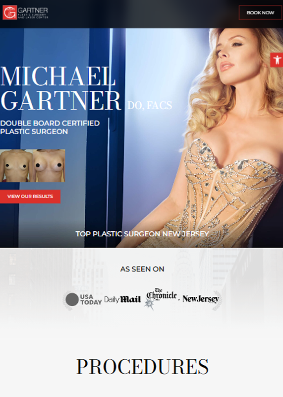
The desktop view is visually striking and professionally designed, with a modern layout, high-quality imagery, and strong branding. Navigation is clean and intuitive, and the content is well-organized with clear CTAs that enhance user engagement. Overall, it gives a premium feel that aligns well with the nature of the services offered.
The tablet view suffers from poor scaling, with small, dense text that makes reading uncomfortable and navigation difficult. Elements like the sidebar form and navigation bar feel cramped and not touch-friendly. Overall, the design lacks responsiveness, giving an outdated and non-optimized experience for tablet users.
The tablet view is sleek and visually appealing, maintaining strong branding with high-quality imagery and elegant typography. Key elements like CTAs, navigation, and procedure highlights are well-positioned and touch-friendly. The layout adapts smoothly to the screen size, offering a premium, user-centric experience.
The mobile view is poorly optimized, with extremely small text and tight spacing that makes reading difficult without zooming. The two-column layout is not mobile-friendly and causes significant usability issues on smaller screens. Overall, it delivers a frustrating user experience and fails to meet modern mobile design standards.
The mobile view is clean, modern, and highly visual, with strong use of branding and high-impact imagery that draws attention. Text is well-sized for readability, buttons are touch-friendly, and the layout flows naturally for mobile users. It delivers a polished and professional user experience that aligns well with the brand’s premium positioning.


