The large hero image could be better balanced, as it takes up significant screen space, pushing essential content further down. The use of multiple call-to-action buttons could confuse users, as there are too many options competing for attention. Additionally, the text blocks are somewhat dense, which may make it harder for visitors to quickly scan the content and find what they need.
The website has a clear, clean design with easily accessible navigation, making it simple for users to find relevant information. The use of high-quality images and concise text creates a welcoming and professional atmosphere, especially with the personalized approach for male recovery. The prominent call-to-action buttons like “Get Help Today” and “Verify Insurance” are strategically placed, enhancing user interaction and guiding visitors smoothly through the site.
The hero image occupies too much screen space, pushing important text and navigation further down, which could make the page feel overwhelming on smaller tablet screens. The text is slightly dense and could be broken into smaller, more digestible sections for easier reading. Additionally, the call-to-action buttons could be more prominently styled to encourage immediate user interaction.
The design maintains a clean and modern aesthetic, with easy-to-read text and well-placed images, creating a balanced layout. The prominent call-to-action buttons, such as “Get Help Today,” are strategically located to encourage user engagement. Additionally, the layout is responsive, with clear sections for various programs, making it easy for users to navigate and find relevant information.
The layout feels too crowded, as the text and images are tightly packed, making it harder to read and navigate on smaller screens. The hero image, although impactful, takes up a significant portion of the screen, reducing visibility for important content below. Additionally, the call-to-action buttons could be more visually distinct to improve user engagement and avoid confusion.
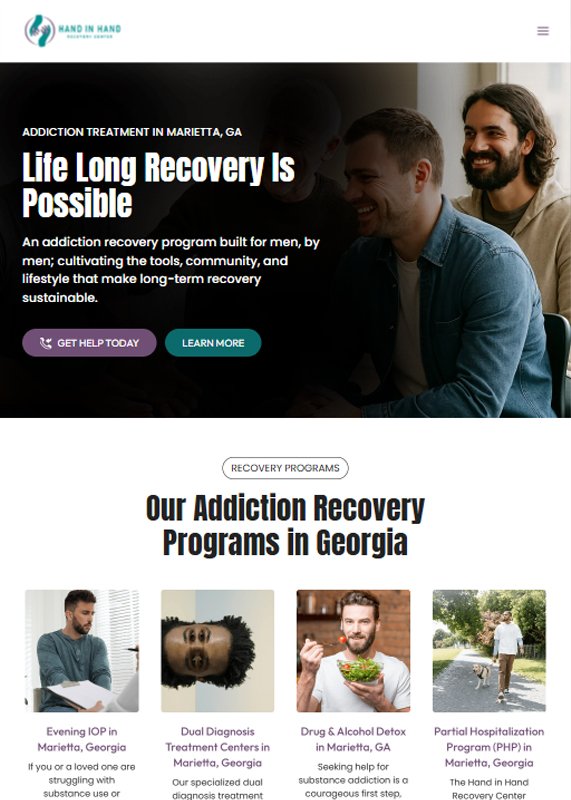
The mobile layout is clean, with clear, concise text that is easy to read on smaller screens. The call-to-action buttons, “Get Help Today” and “Learn More,” are prominent and easy to tap, enhancing user interaction. The design effectively uses high-quality images alongside relevant content, creating a visually appealing and professional experience for users.