The website’s desktop layout feels visually unbalanced with large empty spaces, making it look underutilized and less engaging. The dark color scheme with low-contrast text reduces readability and can strain the eyes. Key interactive elements, like the call-to-action buttons, lack strong visual emphasis, potentially lowering user engagement.
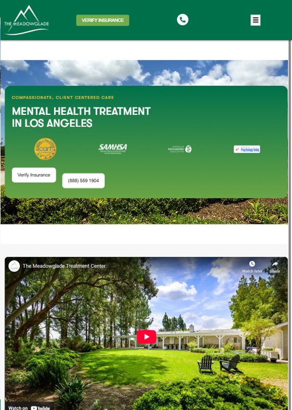
The design of the website is visually clean and professional, with a strong emphasis on trust and care, supported by soothing imagery and clear CTAs like “Verify Insurance.” Performance could benefit from optimizing video embeds and reducing large image sizes for faster load times. Accessibility enhancements such as better contrast ratios and keyboard navigation should also be considered to ensure broader user inclusion.
The tablet layout has excessive blank space, causing important content to appear sparse and disconnected. Text and call-to-action buttons lack strong visual hierarchy, making it harder for users to focus on key actions. Additionally, the video thumbnail is small and not visually appealing, reducing its impact as a central element.
The tablet layout of the website remains visually appealing, with consistent branding and strong use of green gradients that convey calmness and trust. However, the navigation bar becomes slightly cramped, and the call-to-action buttons could use more spacing for easier tap interaction. Optimizing the layout for touch usability and ensuring content does not appear squeezed would enhance the overall tablet experience.
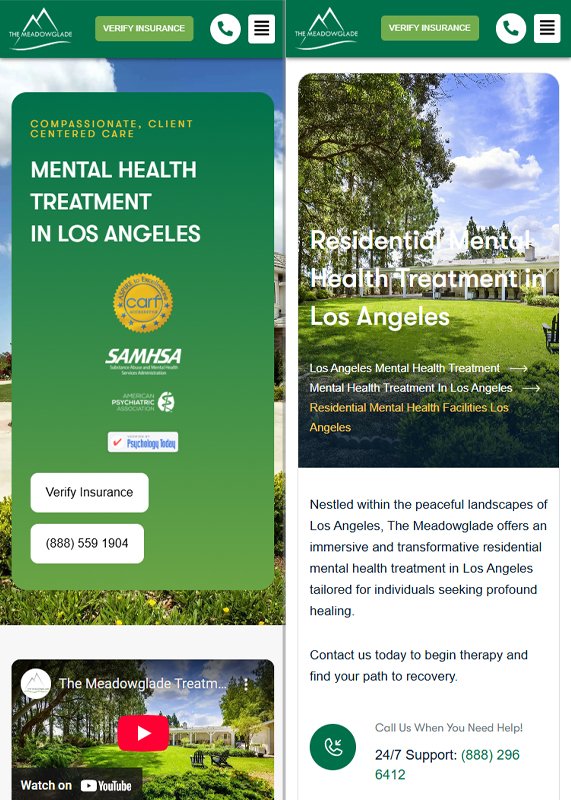
The mobile layout feels cramped, with large text blocks making scrolling tiring and potentially discouraging user engagement. The call-to-action buttons are small and not prominently highlighted, which may reduce click-through rates. Additionally, the video preview and images appear low-impact, failing to grab attention in a fast-scrolling mobile experience.
The mobile version maintains brand consistency and quick access to key actions like “Verify Insurance,” but some layout issues are noticeable—such as overlapping or tightly packed text. The visual hierarchy becomes cluttered, especially in the header section, making it harder to scan content easily. Enhancing font scalability, spacing, and click targets would significantly improve the mobile user experience.


