Scissors & Scotch

Scissors & Scotch is a modern men’s grooming concept that combines the classic barber experience with spa services and a fully stocked lounge. Founded in 2015, the brand offers haircuts, shaves, and grooming treatments paired with a complimentary drink in a relaxed, upscale environment. With multiple locations across the U.S. and a growing franchise network, Scissors & Scotch is more than just a barbershop—it’s a place where clients can enjoy top-quality grooming, unwind with a cocktail, and experience a unique blend of style and comfort.

Regular
Medium
SemiBold
Bold

This Is Text Message
Medium Typography
Just Amazing
Awesome

Branding: Logo Design

website design & development

Before: Outdated Hero Section – Issues

Before

Desktop Design Weaknesses

The website design offers a clean and elegant layout, perfect for showcasing high-end jewelry, with a focus on clarity and ease of navigation. The images are sharp and vibrant, highlighting the intricate details of the jewelry pieces, which aligns with the brand’s luxurious and sophisticated aesthetic. However, the overall use of white space and font choices could be optimized to enhance readability and user engagement on desktop screens.

After

Desktop Design Strengths

The new website design presents a more refined and elegant aesthetic, with a focus on beautiful imagery and a minimalist layout. The use of neutral backgrounds complements the jewelry, allowing the products to be the star of the page. The user experience is enhanced with easy-to-navigate categories, and the call-to-action buttons stand out for better engagement, while the soft color scheme adds to the luxurious, modern feel of the brand.

Before

Tablet Design Weaknesses

In the tablet view, the design feels quite sparse, with large empty spaces that may make the page appear unfinished or lacking in content. The text, though minimalistic, feels disconnected from the rest of the layout, and the large button at the bottom might seem out of place or overly emphasized. Additionally, the lack of detailed product images or engaging content above the fold could lead to a less engaging user experience.

After

Tablet Design Strengths

This tablet view of the Everett jewelry website has a clean, elegant layout that aligns well with the luxury branding of the product. However, the top banner text (“Schedule a virtual consultation…”) could be more prominent or styled differently for better visibility, and the call-to-action buttons like “Shop Bands” and “View All” would benefit from stronger contrast for accessibility. Overall, the site achieves a premium aesthetic, but optimizing button hierarchy and ensuring responsive spacing adjustments would enhance both usability and engagement.

Before

Mobile Design Weaknesses

This mobile view feels a bit cluttered, with inconsistent spacing and visual hierarchy making it harder to scan quickly. The text on the banner and product names is small and could cause readability issues on smaller screens, while the “View Products” button lacks strong contrast, reducing its visibility as a call-to-action. Overall, the layout doesn’t feel as polished as the tablet version, and it would benefit from cleaner alignment, larger typography, and more breathing room between sections.

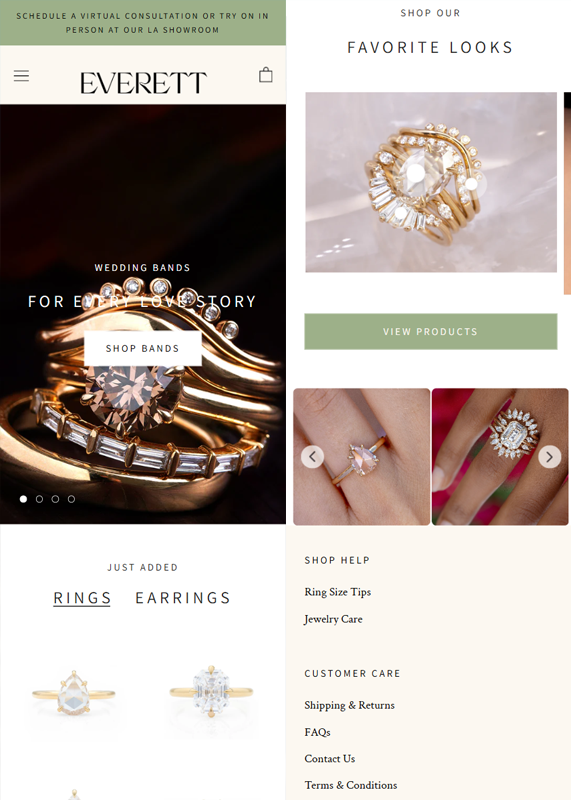
After

Mobile Design Strengths

This updated mobile view is much stronger, with improved balance between visuals and text, making the jewelry pieces stand out beautifully. The call-to-action buttons like “Shop Bands” and “View Products” have better contrast and visibility, creating a clearer shopping flow. Additionally, the clean spacing, consistent typography, and inclusion of customer care links at the bottom enhance both usability and trustworthiness for mobile users.

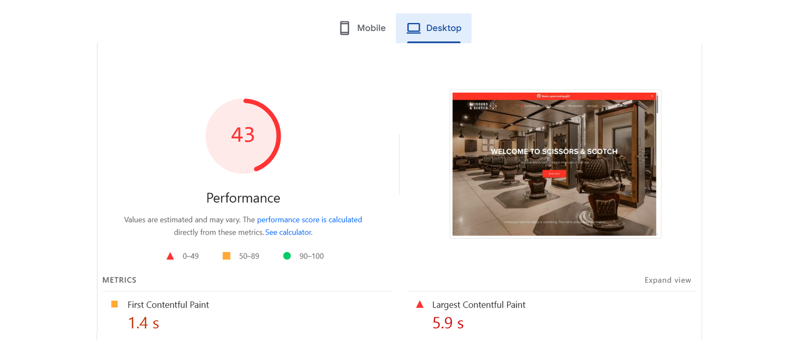
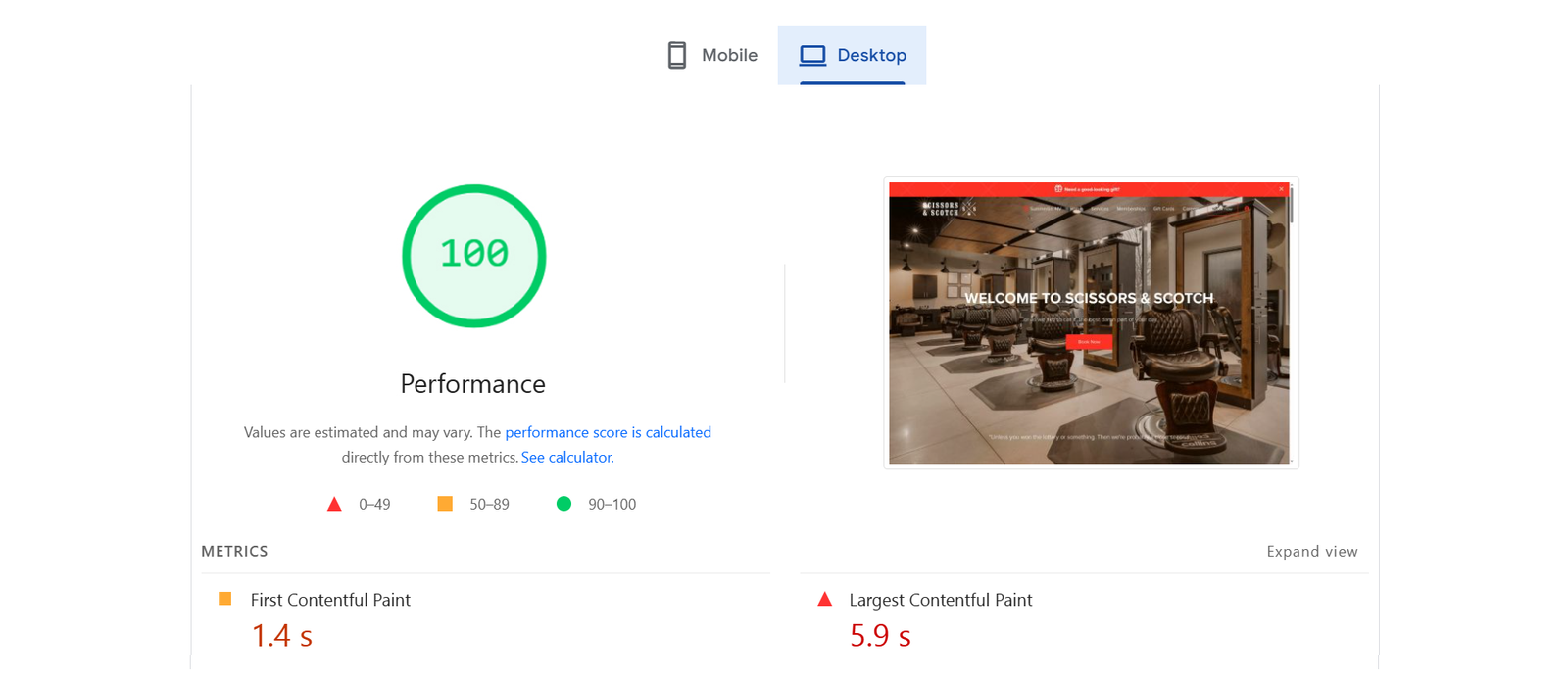
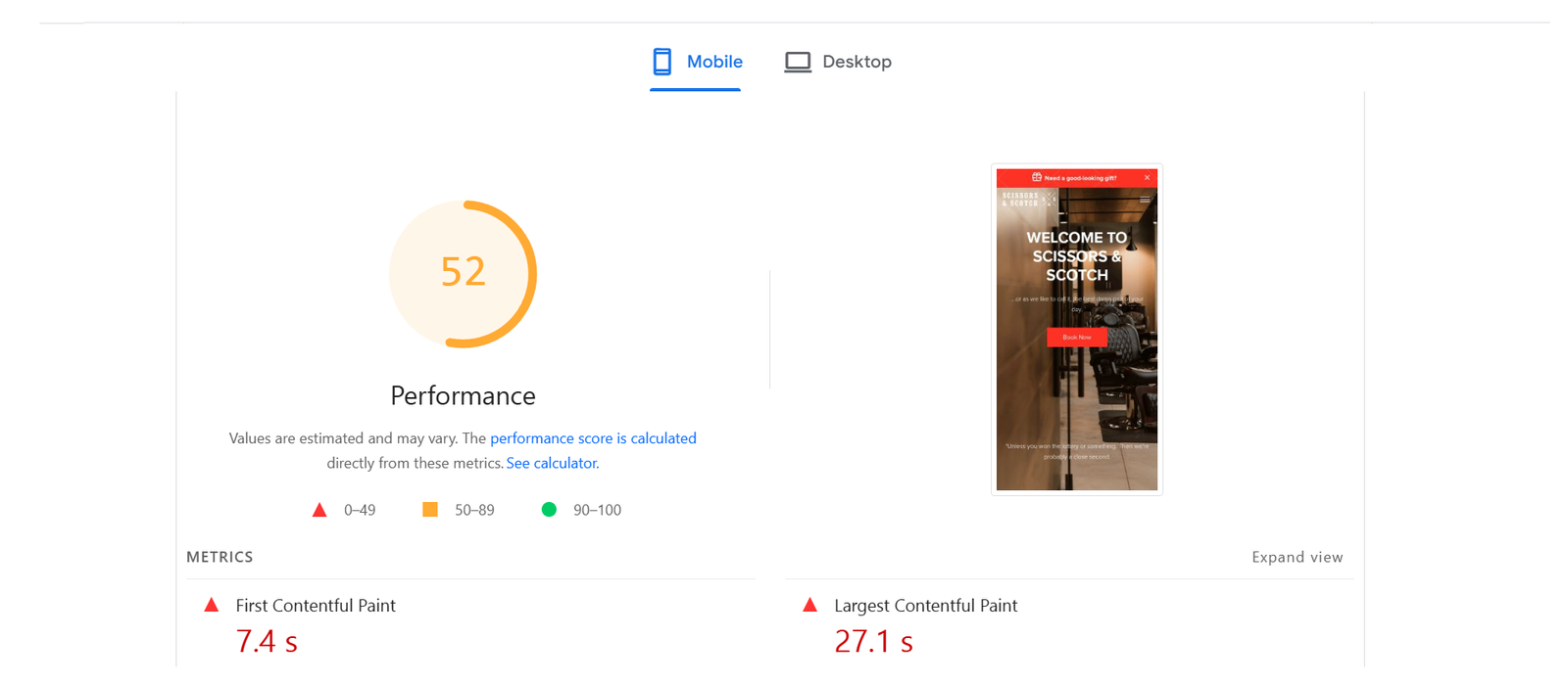
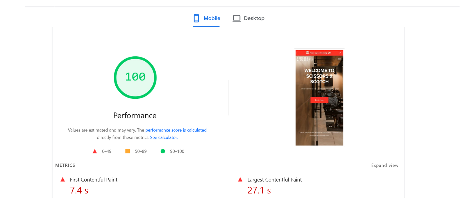
Core Web Vitals Before/After

Desktop

Mobile

SEO Growth Strategy

Search Performance Report (28 Days Overview)

A month ago, the website had 59 thousand clicks, 5.94 million impressions, a 1% CTR, and an average position of 14.1. Performance demonstrated steady traffic with peaks that could be seen, indicating strong visibility and the possibility of ongoing optimization to boost click-through rates.

Search Performance Report (3-Month Overview)

The website had 5.94 million impressions, 59 thousand clicks, a 1% CTR, and an average position of 14.1 over the previous three months. Traffic was steady, peaking toward the end of July, indicating high visibility but room for improvement in click-through rates. Continued content optimization could help improve rankings and engagement.

Search Performance Report (6-Month Overview)

Six months ago, the website gained strong visibility with 59K clicks and 5.94M impressions (1% CTR, position 14.1). Although traffic was stable overall, late-July peaks point to untapped potential for increasing CTR through smarter SEO and content adjustments.

Google Search Achievement Update

The search performance of our website has reached an important juncture in its development. In just 28 days, we had 22 thousand clicks from Google Search as of April 8, 2025. We are making steady progress toward the next objective, which is to complete 18.6 thousand out of 25 thousand clicks within the same time frame. Our growing online visibility and the efficacy of our SEO efforts are highlighted by these accomplishments.

Milestone Achievements: Google Search Impact

Over time, our website’s search engine performance has increased steadily and impressively.
These milestones show that our ongoing SEO strategies are working and that our audience is trusting us more and more.

Website Performance Summary — Last 7 Days

User activity reached 4.7K, down 3.3%, with a sharp 52.3% daily drop.
Top Channel: Paid search and direct traffic are the next two choices, followed by organic search (with 4,000 users). User retention could use some work, despite the strong organic performance.

Website Performance Summary — Last 30 Days

Despite a 4.6% dip, Organic Search still leads with 4.4K sessions. Display traffic surged +2,250%, and Cross-network rose +26.2%.

The standout pages include The Effects of Taking… (3.2K, +13.1%) and Best Over-The-Counter… (+21.9%).
Top countries: US (3.3K, −2.2%), UK, Canada; Ireland grew +5.1%.

Website Performance Summary — Last 90 Days

The website recorded strong growth compared to the previous year:
The peak months for traffic were October and April. In the last 30 minutes, five individuals from Denmark, Australia, the United Kingdom, and the United States were online.

Website Performance Summary — Last 12 Months

Over the past three months, the website experienced a decline across all key metrics:
Trends in traffic remained fairly constant, with a slight decline in comparison to the previous period. Five people from the United States, Denmark, Australia, and the United Kingdom were online in the last 30 minutes.

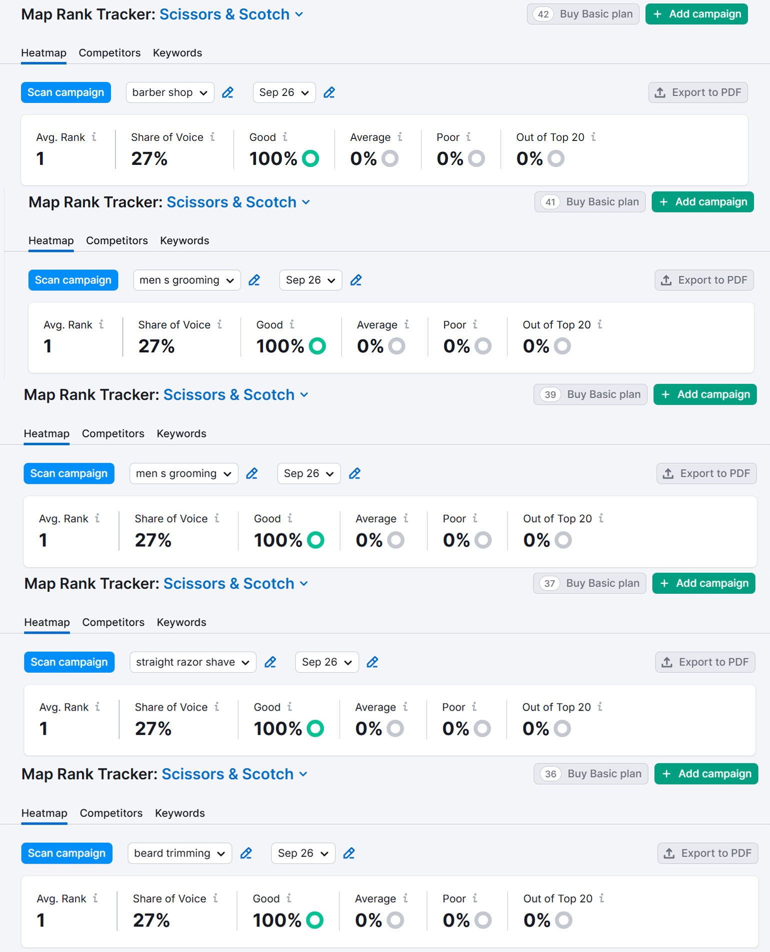
Google Map

Map 3 Pack

50 Miles Radius